Recent work i've created
View all work »-
01 UX-Product Design
- Voice - Blockchain Social Media App »
- Gatorade - Sweat with the Best »
- Impact Journals - UX Redesign »
- Undisclosed - Financial Enterprise App »
-
02 Visual UI Design
- Mtn Dew - Gamer Hub »
- Vans Foods - Web Redesign »
- Mtn Dew - Assemble the Avengers »
About Me
View my full Experience »
-
I’m an enthusiastic design leader, passionate about everything from building teams to nerding out about human psychology. I'm experienced in all facets of Product Design and know what it takes to be a successful Design group within a software organization. I can illustrate. Present. Inspire. Evangelize. Mentor. Teach. I'm currently the Director of Product Design at Ozmo, growing a small but mighty design practice. ...read more
Exadel
Rebranding a Global Software Firm
After Exadel purchased Amadeus, a Boulder Software shop, the newly larger and more capable company needed to reposition itself. The original brand was dated, and felt old.
The goal that myself, Creative Director and the Marketing Director took upon ourselves was to attain something more modern and approachable. More human if you will.
I then began working with my Creative Team and the Marketing Team to develop an entirely new Brand Identity for Exadel, speaking to intended customers with a whole new gravitas.
My Role: Creative Director, Brand Designer, Art Director
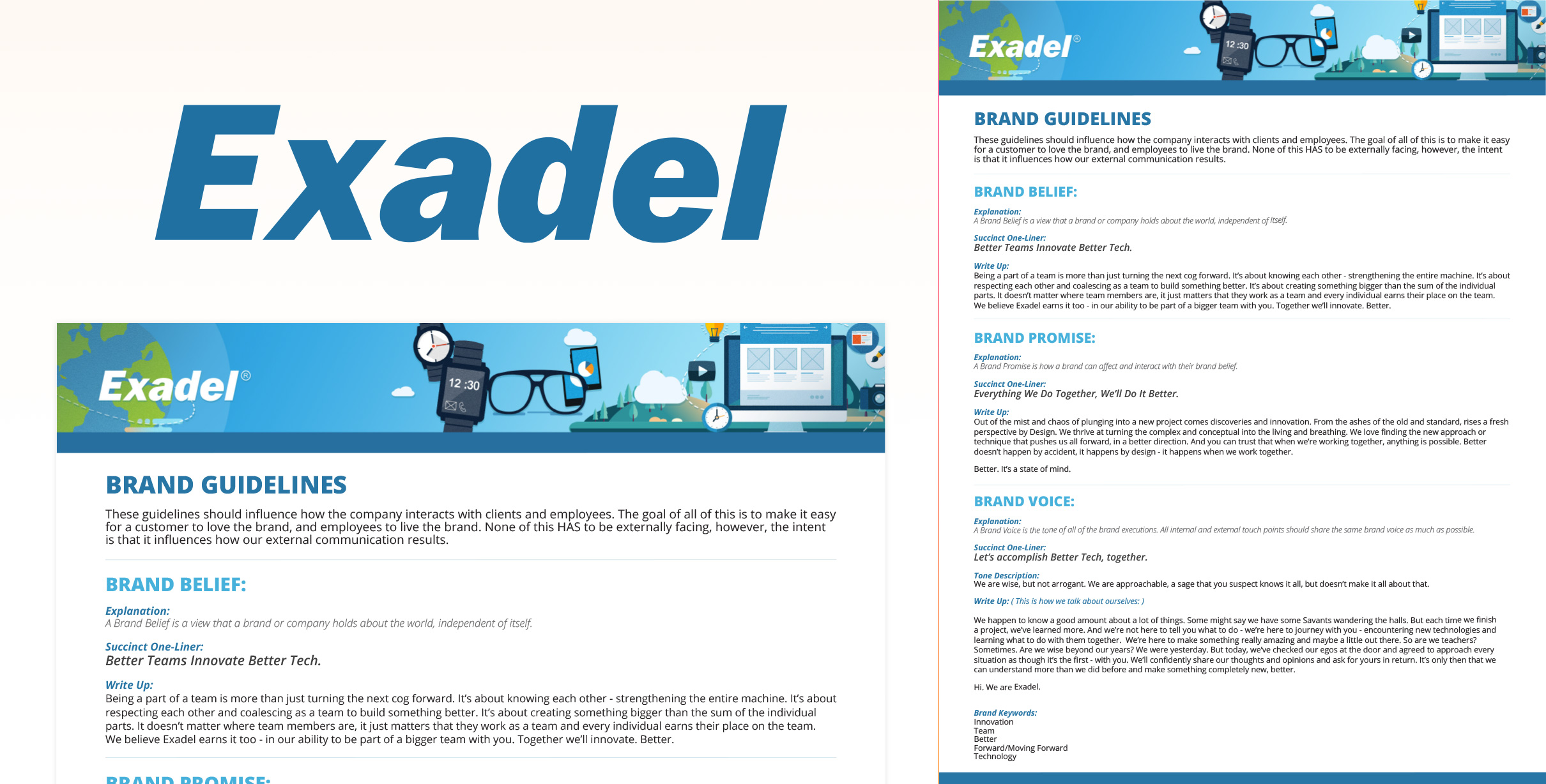
The Original Brand / New Brand Guidelines
The old logo, seen here on the left, was simply Arial Bold Italic. Almost void of any personality or character, the first step in this process was writing a new Brand Belief, Brand Promise and Brand Voice, seen here in the form of the Brand Guidelines.
Working closely with the executive team, the new Brand was described in a way in which all parties felt as though matched our goals for the revamped Identity.
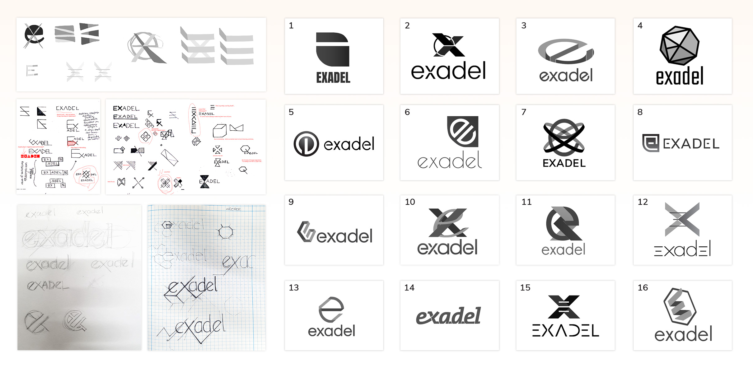
Logo Ideation
Working with my team of Designers, I lead all of through several rounds of ideation and sketching, always regrouping as a team for shared thoughts and critiques.
Ultimately, after several rounds of brainstorming, I took our top ideas and concepts and developed more refined digital versions in Illustrator, seen on the right.
Next came several rounds of circling these refined ideas around the Executive and leadership teams, for further refinement and buy in. A lot of this process came in the form of Internal Presentations, educating Executives on how these concepts alluded back to our newly developed Brand Guidelines.
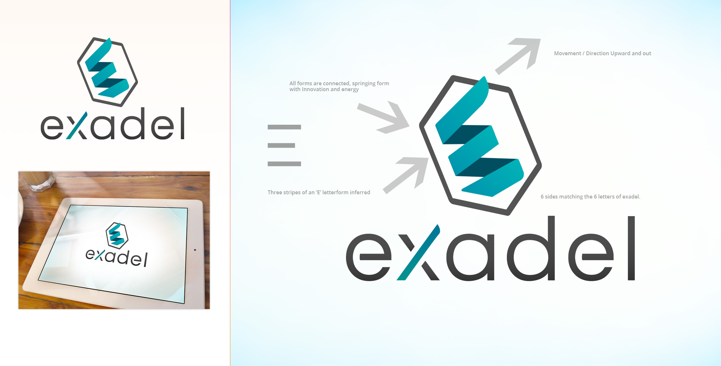
Final 3 Concepts - The Spring Concept
I narrowed our concepts down to a final 3. At this point, I knew some of our color palette would be centered around Blue, which i began to incorporate to better bring these ideas to life for further decision making.
This concept captured movement, an abstract interpretation of the E letterform, and represented a connective tissue - all important aspects of communicating our new brand.
The lowercase word mark was also critical in the new identity, as we wanted to moved away from the more formal and stale uppercase previous logo.
Overall this concept felt approachable, energetic and modern.
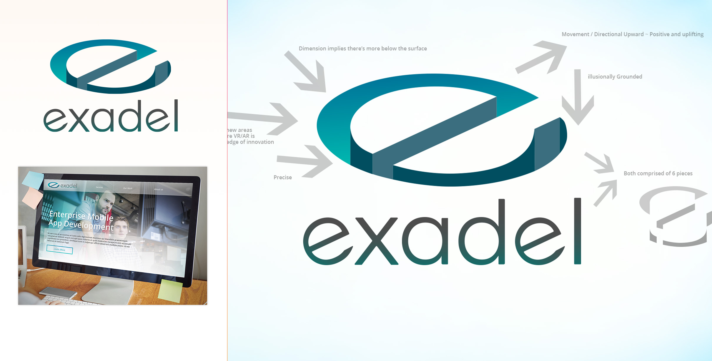
Final 3 Concepts - The Grounded Concept
This concept pulled in more heavily the lowercase 'e' letterform. However, the interesting aspect of this concept was that the logo mark appeared to drop down into the surface - which paired nicely with the idea of a lot of what made Exadel great at software was beneath the surface, not always immediately seen.
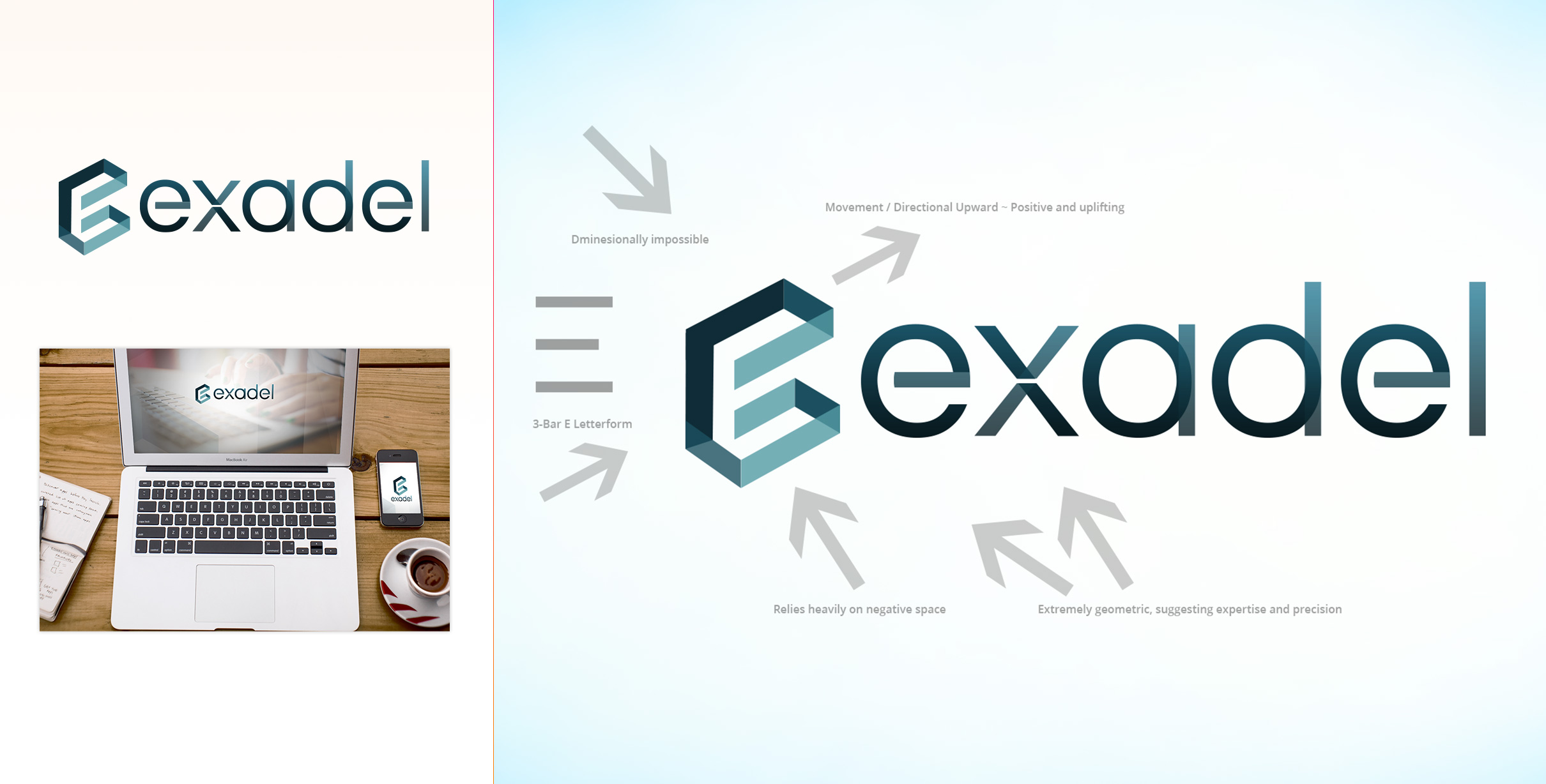
Final 3 Concepts - The Dimensional E Concept
This concept leaned heavily into geometry and dimension, while still capturing a hint of the old, capital 'E' and making it part of the new identity.
I still featured an upward and outward, positive movement. This concept also abstractly danced around an impossible dimensional shape, which as a mark, added a little playfulness.
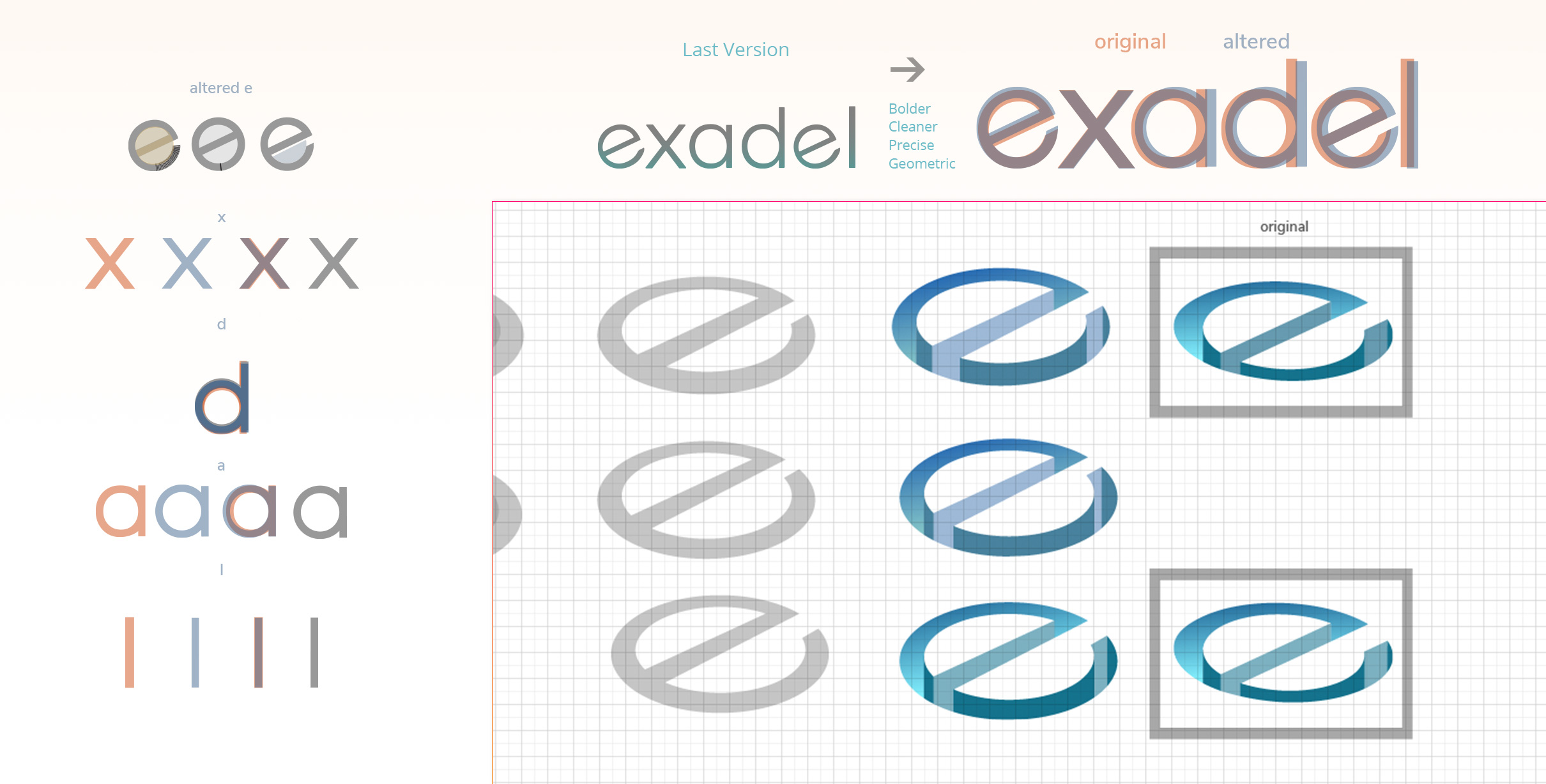
Iterating the Final Concept
The final concept was chosen, and now it was time for additional refinement and iteration.
My team and I worked on improving rhythm, creating evenly spaced and shaped, perfectly geometric letterforms within the word mark. We also corrected and improved the Logo mark, by adjusting the perspective so it became more realistically depicted in depth.
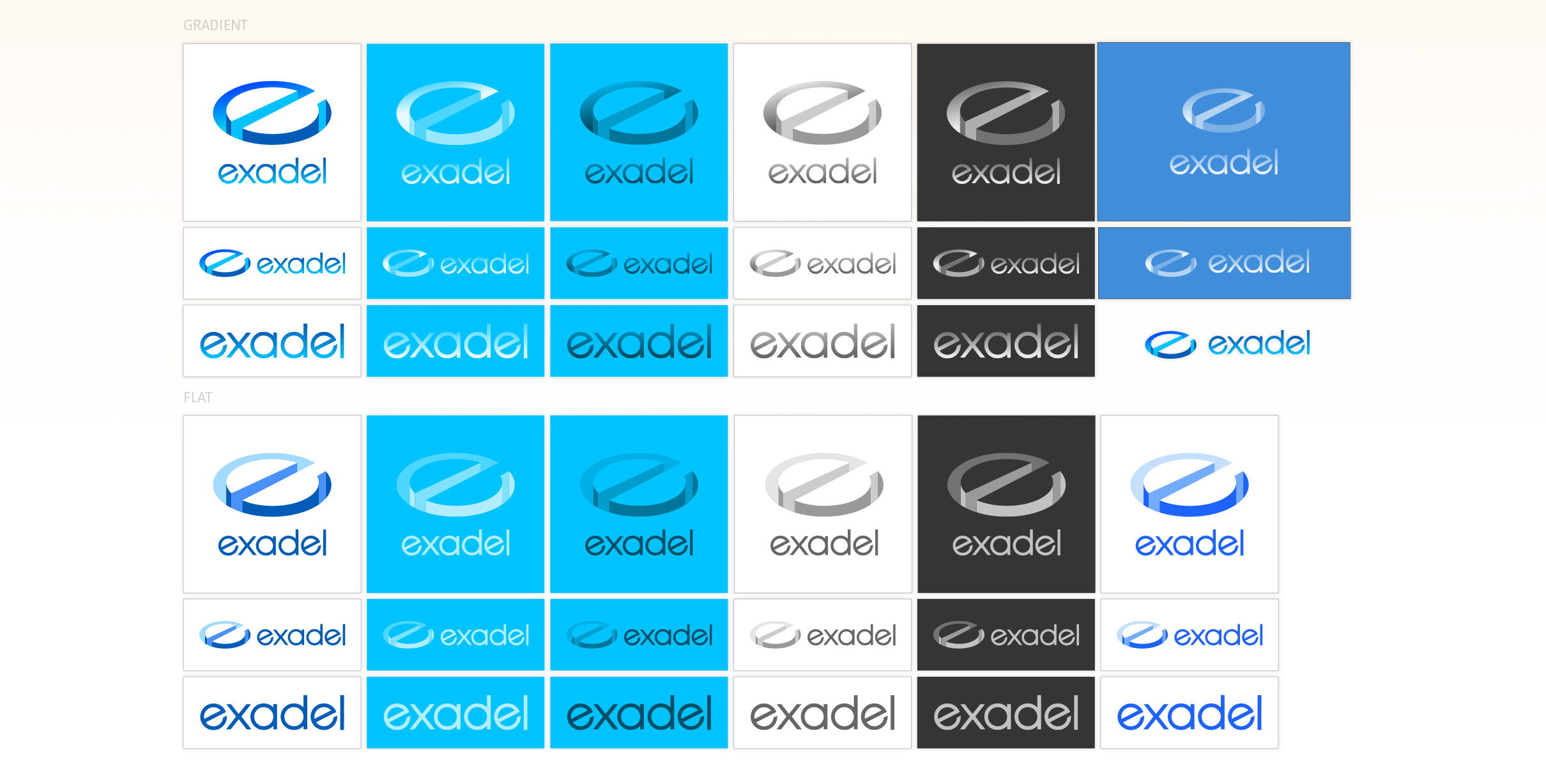
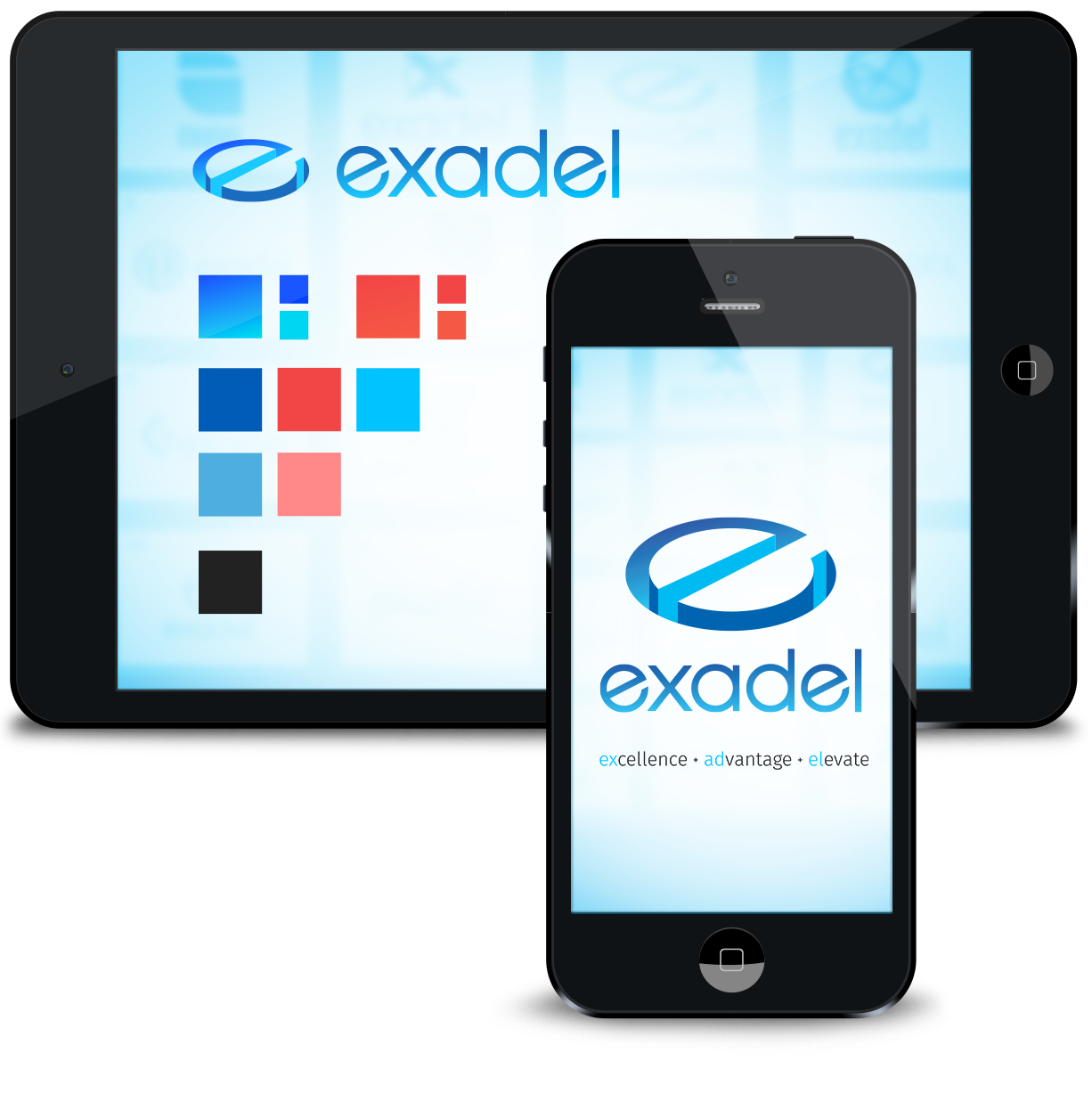
Logo Versions
As with any proper identity and brand, the logo needs to work on top of any surface or medium.
Here you can see to the extent at which the logo was developed into numerous versions and variations, for all possible purposes.
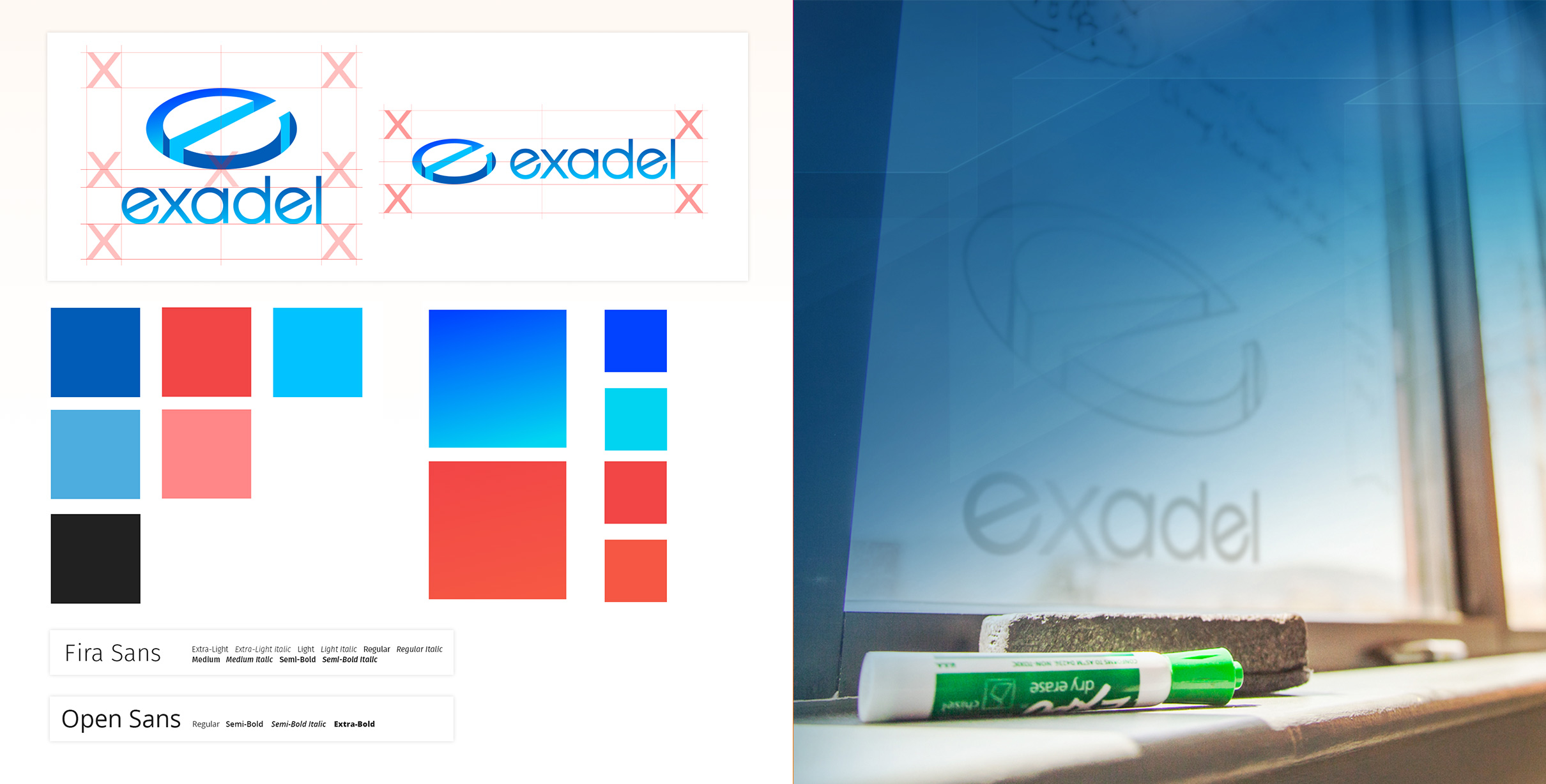
Brand Style Guide
Again, one of the next natural steps in this process - especially for a Global company - was to create and disperse a Brand Style Guide. I actually utilized Google Sites and created a small website, easily accessible and found within our company's own toolset.
A bit of the Guide, shown here, encompassed Colors, gradients, Logo spacing, and Typography. The Full online resource contained much more detail about the overall brand, and where appropriate, offered easy means of downloading certain Brand assets, such as logo files.
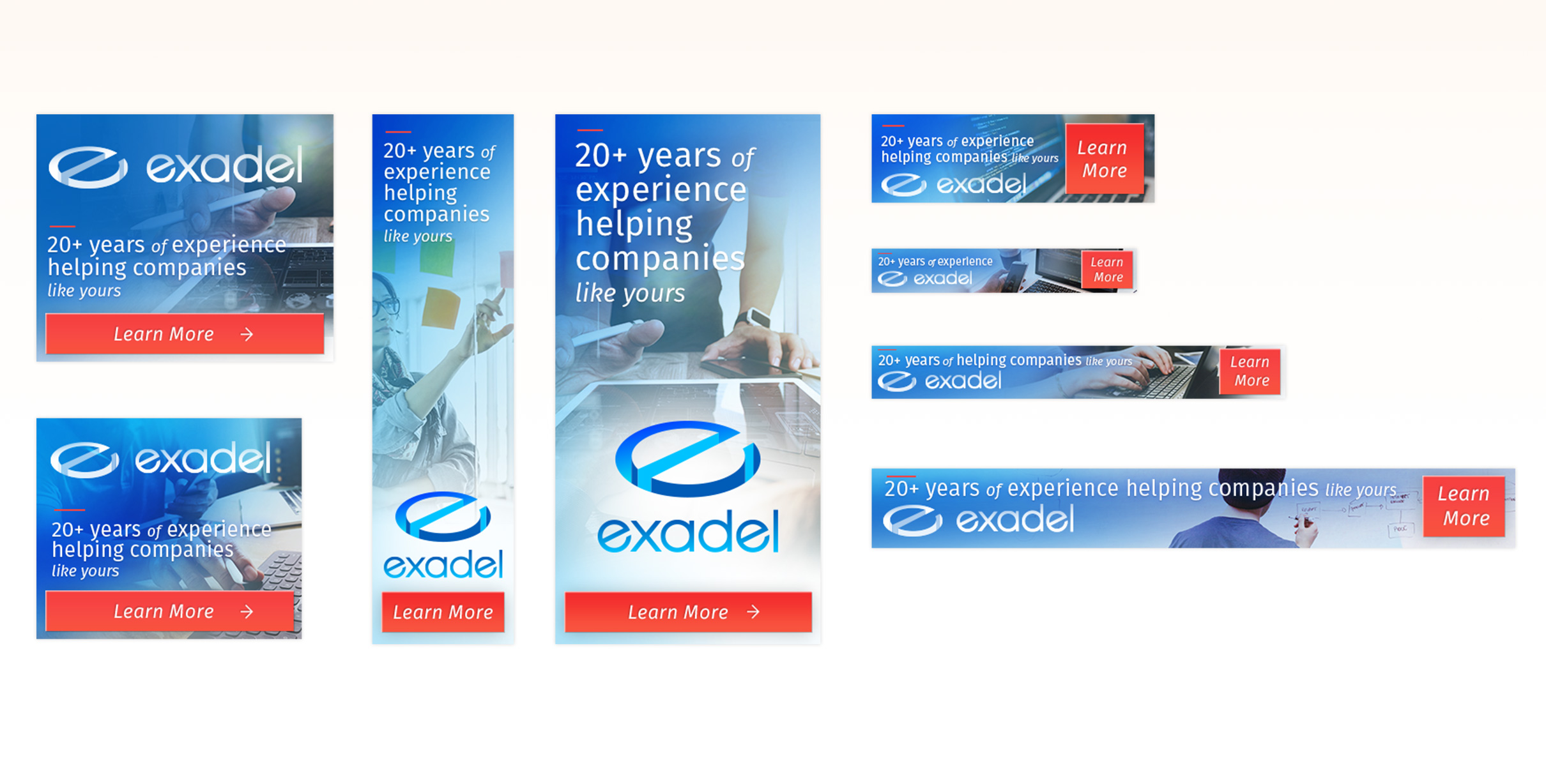
Advertising
Some examples of advertising, Online Banners shown here, followed the development of the Brand visuals.
I pulled in imagery of actual people, attempting to further humanize the company's visuals.
Marketing and myself coordinated to generate messaging and create ads that felt new, modern and spoke to our technological capibilities.
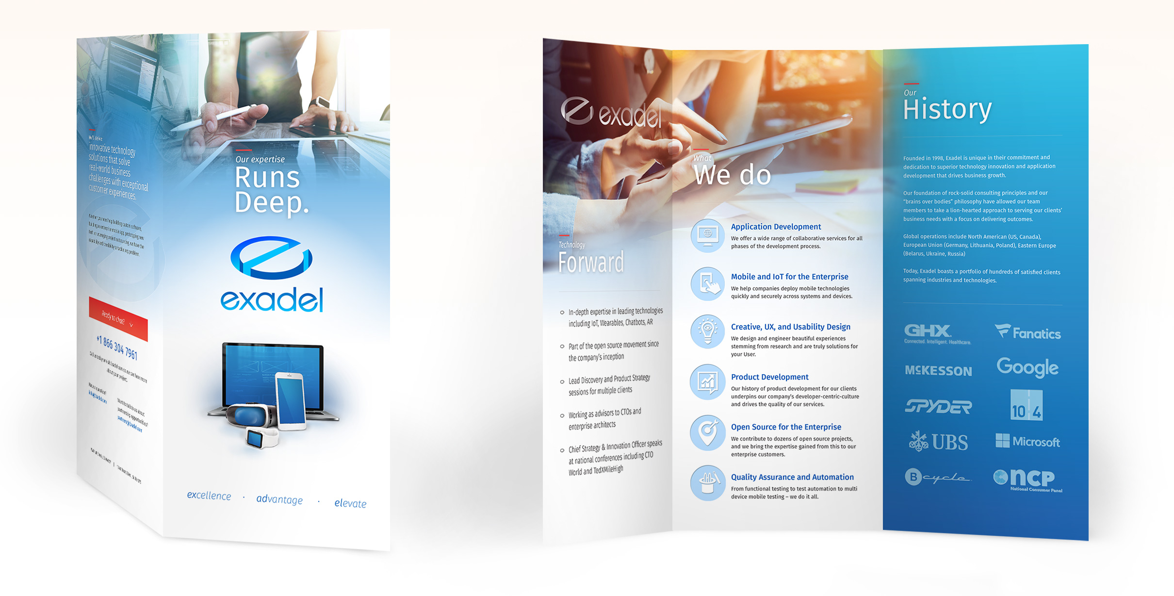
Brochure
Here, an example of a brochure can be seen. Again, distilling our capabilities and successes as a software company down to simple messaging was not necessarily easy.
A clean and open design, centered around a succint story was essential.
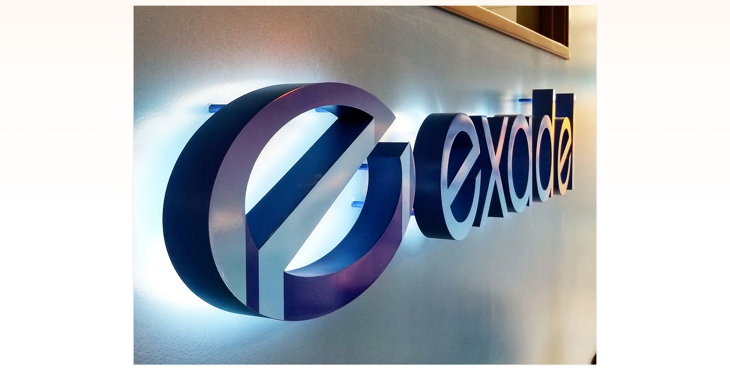
Signage
Last but not least, a shot of one of the many signs put up around the Boulder Office.

Selected work I've created
-
01 User Experience
- Gatorade - Sweat with the Best »
- Exadel - Responsive Redesign »
- Impact Journals - UX Redesign »
- Visit San Antonio - Tourism and Booking Web Platform »
-
02 Branding
- Exadel - Rebrand »
- Soapbox Marketing - Branding »
-
03 Product Design
- Voice - Blockchain Social Media »
- Verizon Wireless - Device Simulator »
- Undisclosed - Financial Enterprise App »
- FEMA - Community Rating System »
-
04 Usability
- Image Processing - Usability Study »
-
05 Visual / UI Design
- Mtn Dew - Gamer Hub »
- Vans Foods - Web Redesign »
- Mtn Dew - Assemble the Avengers »
-
06 Packaging Design
- Native Eyewear - Packaging Concepts »
- Mtn Dew - Spiked Lemonade »
-
07 Campaign Design
- 3M - Telecom Division »
- Mtn Dew - Black Label »

Some things I enjoy
Human Factors and Psychology, Ideation, Collaboration, UX Research, Strategy, User Personas, User Stories + Flows, Information Architecture, Wireframing / Prototyping, Art Direction, Mentoring / Teaching, Hierarchy, Visual Design, Leading Teams, Illustration, Conceptual Thinking, Live Music, Veggies, Beers, Hiking, And long walks on the beach.
You’ve reached the bottom, kudos. Jump to My Work, Learn About my Experience or Get in Touch. Perhaps, you'd like to return to the top?
© Tony Phillips