Recent work i've created
View all work »-
01 UX-Product Design
- Voice - Blockchain Social Media App »
- Gatorade - Sweat with the Best »
- Impact Journals - UX Redesign »
- Undisclosed - Financial Enterprise App »
-
02 Visual UI Design
- Mtn Dew - Gamer Hub »
- Vans Foods - Web Redesign »
- Mtn Dew - Assemble the Avengers »
About Me
View my full Experience »
-
I’m an enthusiastic design leader, passionate about everything from building teams to nerding out about human psychology. I'm experienced in all facets of Product Design and know what it takes to be a successful Design group within a software organization. I can illustrate. Present. Inspire. Evangelize. Mentor. Teach. I'm currently the Director of Product Design at Ozmo, growing a small but mighty design practice. ...read more

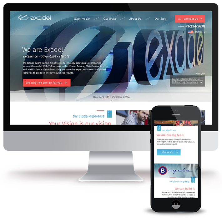
Web Redesign
Responsive Web Platform Redesign
After bringing Exadel through a rebranding process, I needed to update our website and bring it into a better storytelling platform, where the services and offerings of Exadel could lead to conversion and generate sales.
Working directly with the executive team and the marketing director, we collaboratively generated a high-level idea of our future content structure.
My Role: UX Director, UX Design, IA Architect, Art Direction, Usability Expert
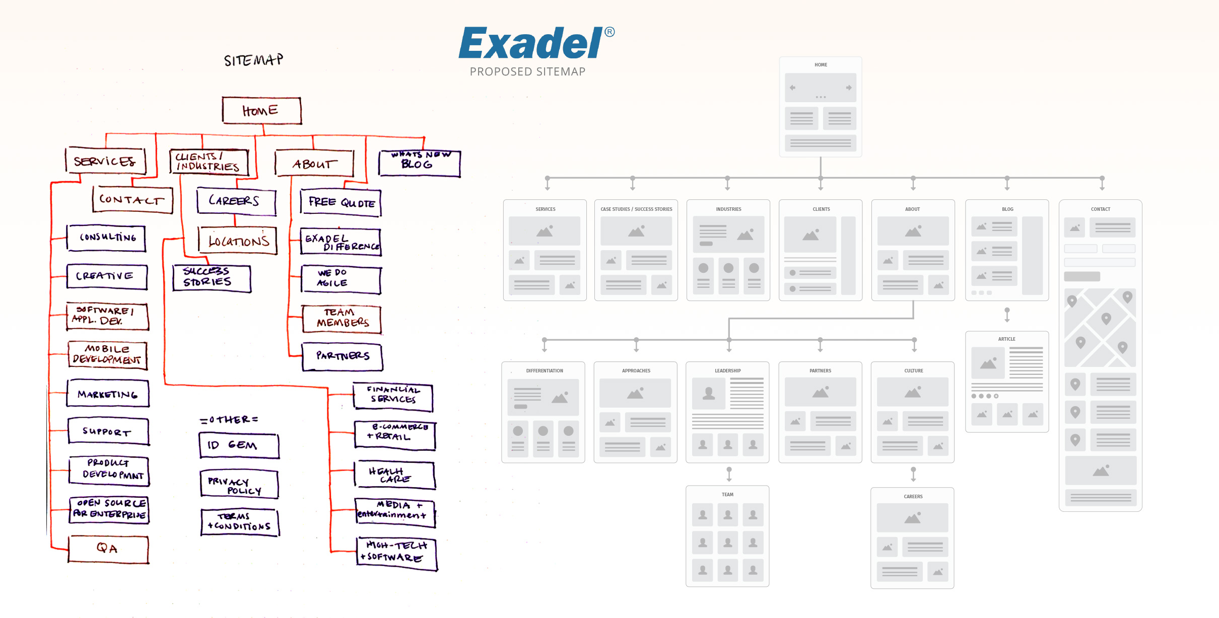
Sitemap / Information Architecture
The need to move quickly was imperative. Working with my team of Product Designers, we rapidly plotted out an architecture for the new site.
To cotinue in our fast pace, I produced a Paper prototype, which I was able to gain participation and experimentation from the Leadership Team. Building this rapid prototype enabled all of us to quickly iterate and jump into designs.
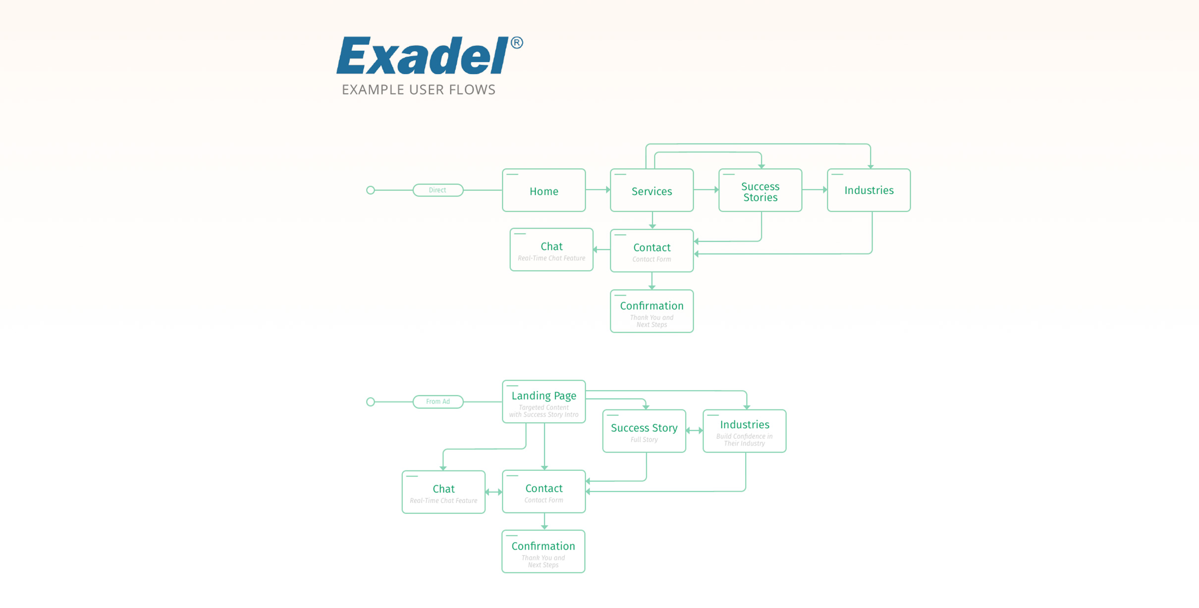
User Flows and Journeys
As lead generation was critical for the new site, my team and I plotted out User Journeys that captured imperative paths through our intended architecture.
Visual Concepts
To generate as many Visual ideas as possible, I lead my entire team of Designers through an exercise of exploring a few key pages in design application. Each designer, including myself, came up with design ideas that we collaboratively iterated on as a team.
Here you can see one of my concepts, this one focused on blues and also highlighting some endued meaning within our new brand.
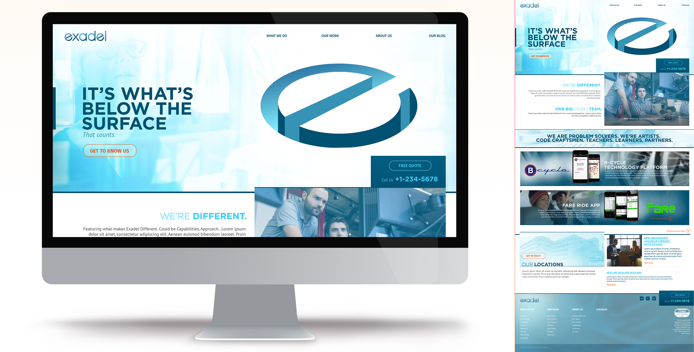
Chosen Design Direction
The ultimate design direction incorporated pieces and aspects of several of the concepts. The infamous Frankenstein! However, my team and I worked to blend and marry all desires into one cohesive, clean look and feel.
The focus was on impactful imagery and gradients, while leaving room for focus to be on our messaging and storytelling.
Design Direction - Scrolled Landing
The concept utilized a clean, structured grid - creating a comfortable vertical rhythm down the page. A numbered, alternating layout allowed for our story to expand and contract, depending on the current company iniatives.
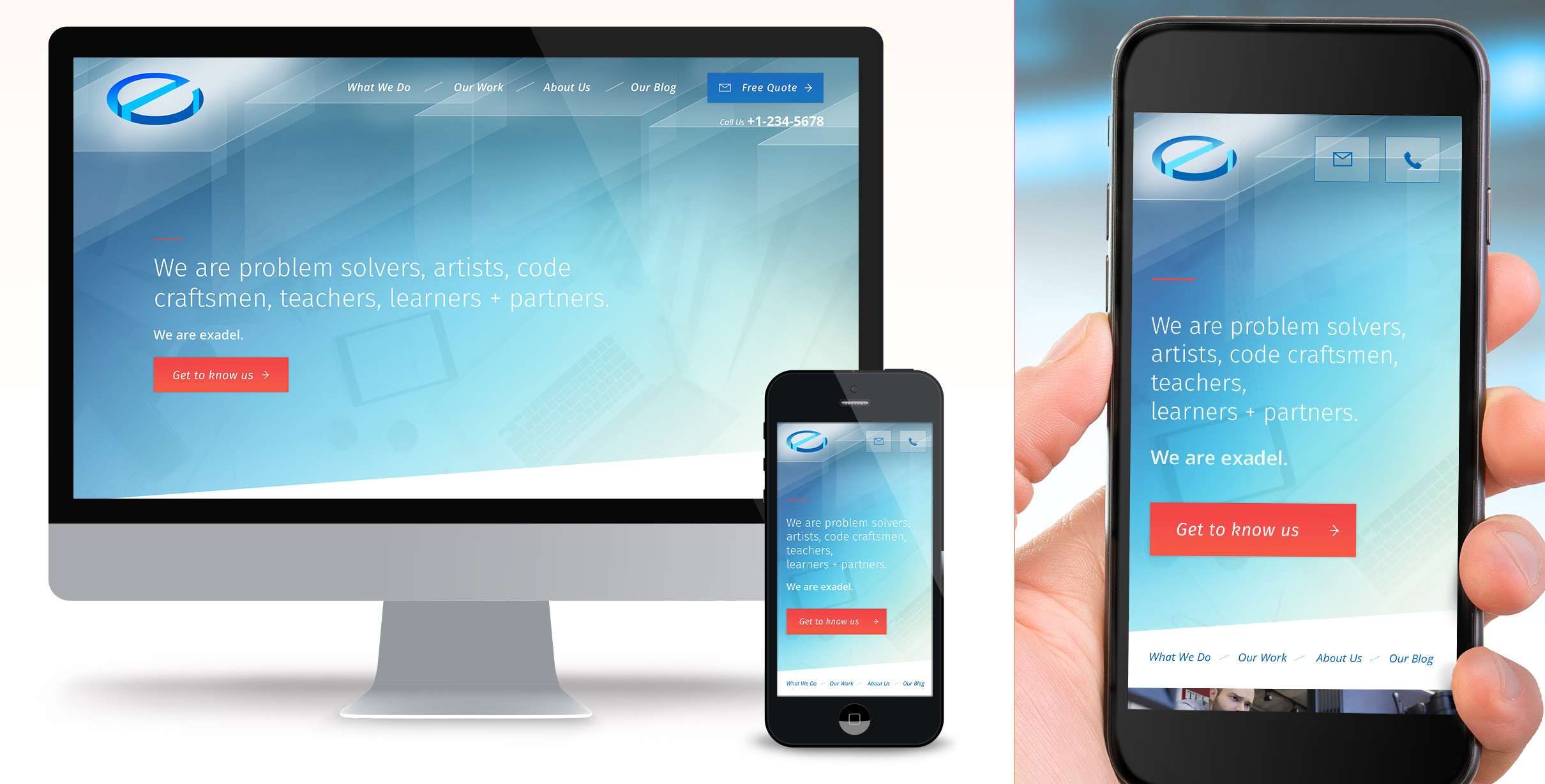
Mega Menu
Conceptually, we planned on the navigational structure being a little unorthodox. The site needed to be timely as far as what services and projects we focused on - so rather than having a navigation with everything, I designed a menu that could flex with our current topics - promoting iniatives at the right time.
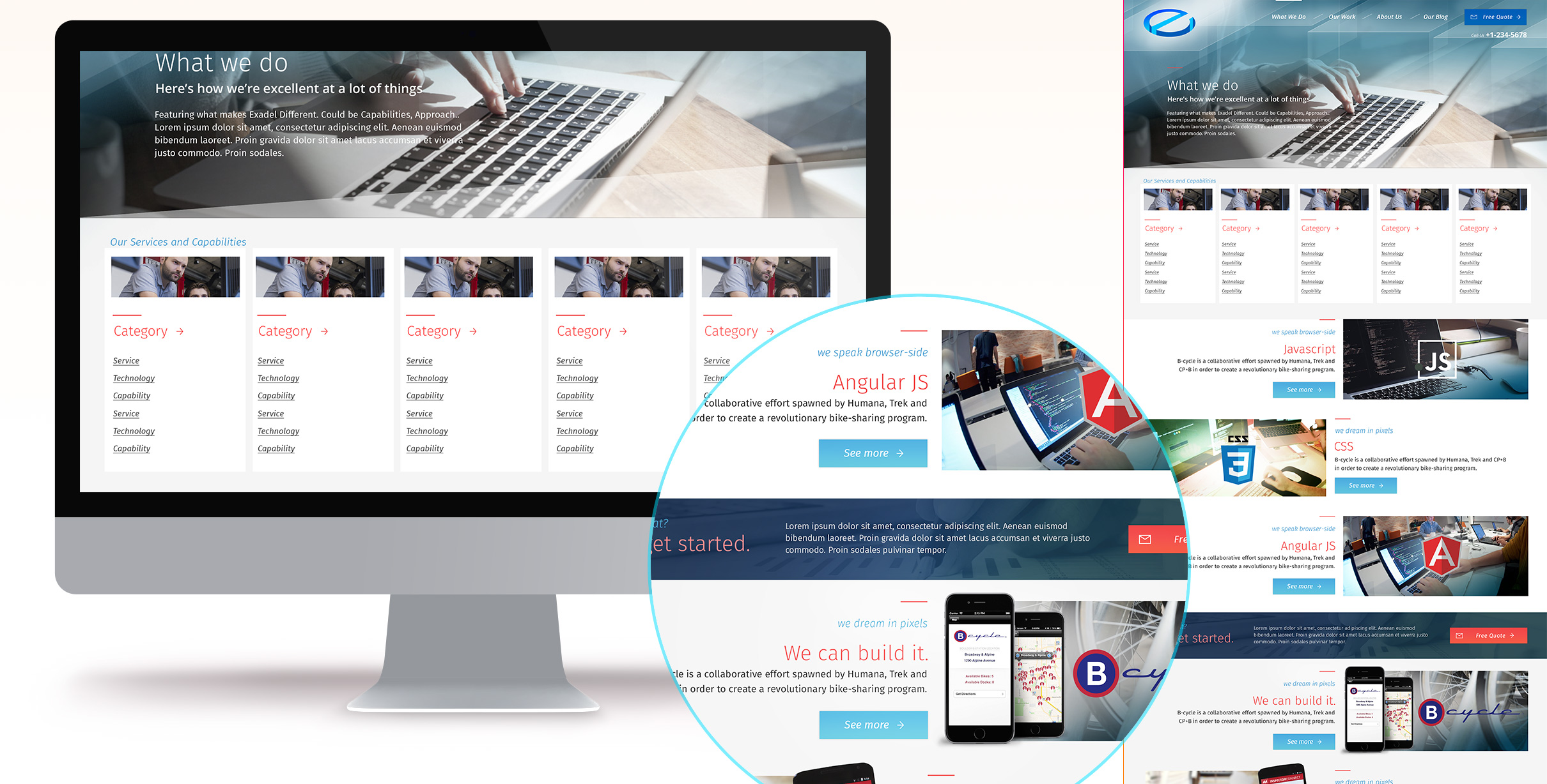
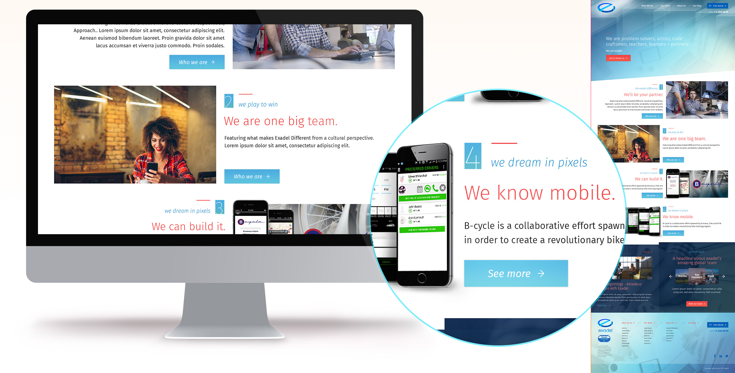
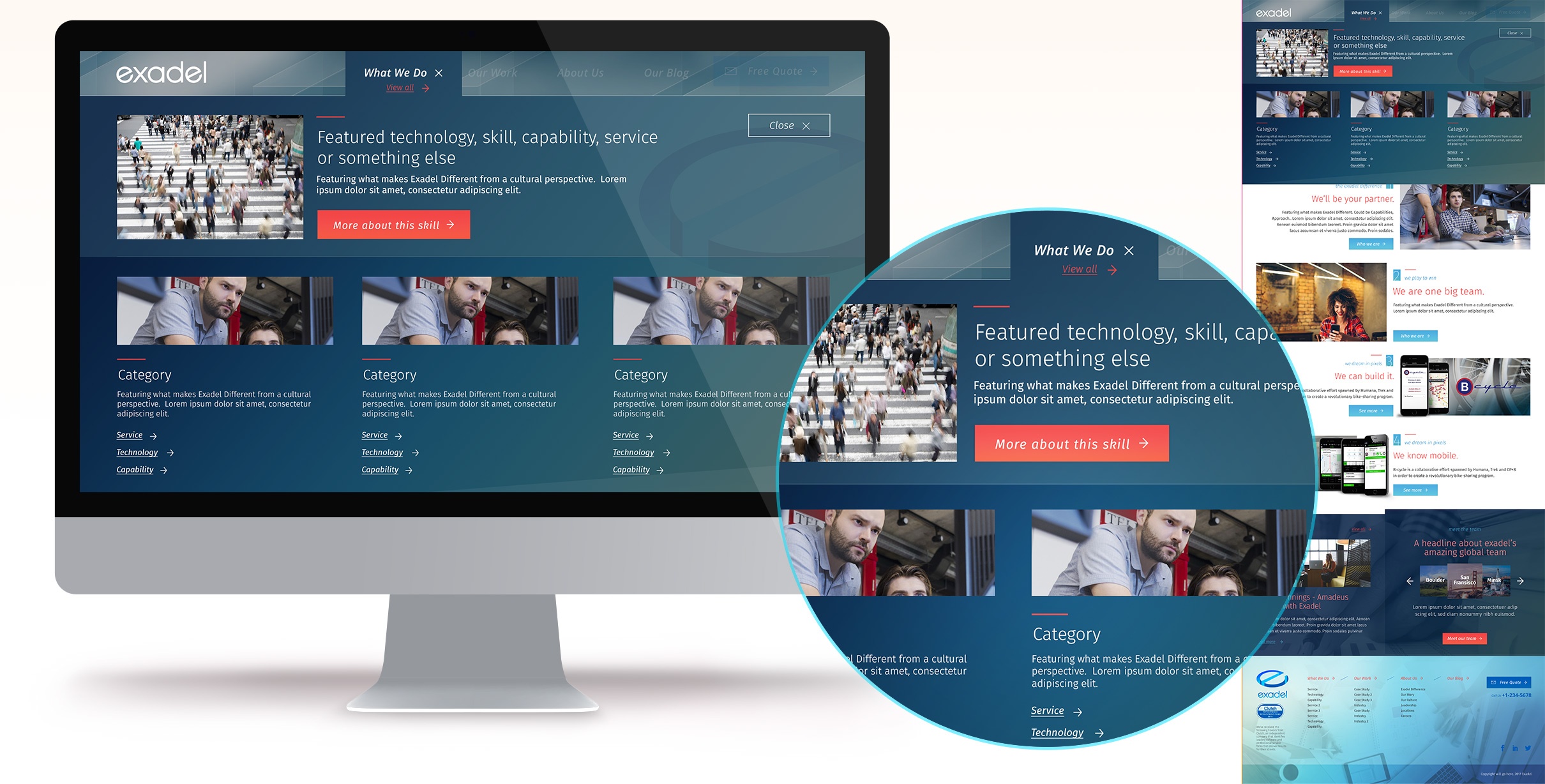
Services - What we do
For a software company, Our Services were critical to demonstrate to new potential customers. Here at the What we do Landing page, our Users were presented with a categorical view into our expertise.
Beyond that and throughout the site, our tiled system allowed for easily associating relative technologies and case studies with whatever content the user was currently viewing.
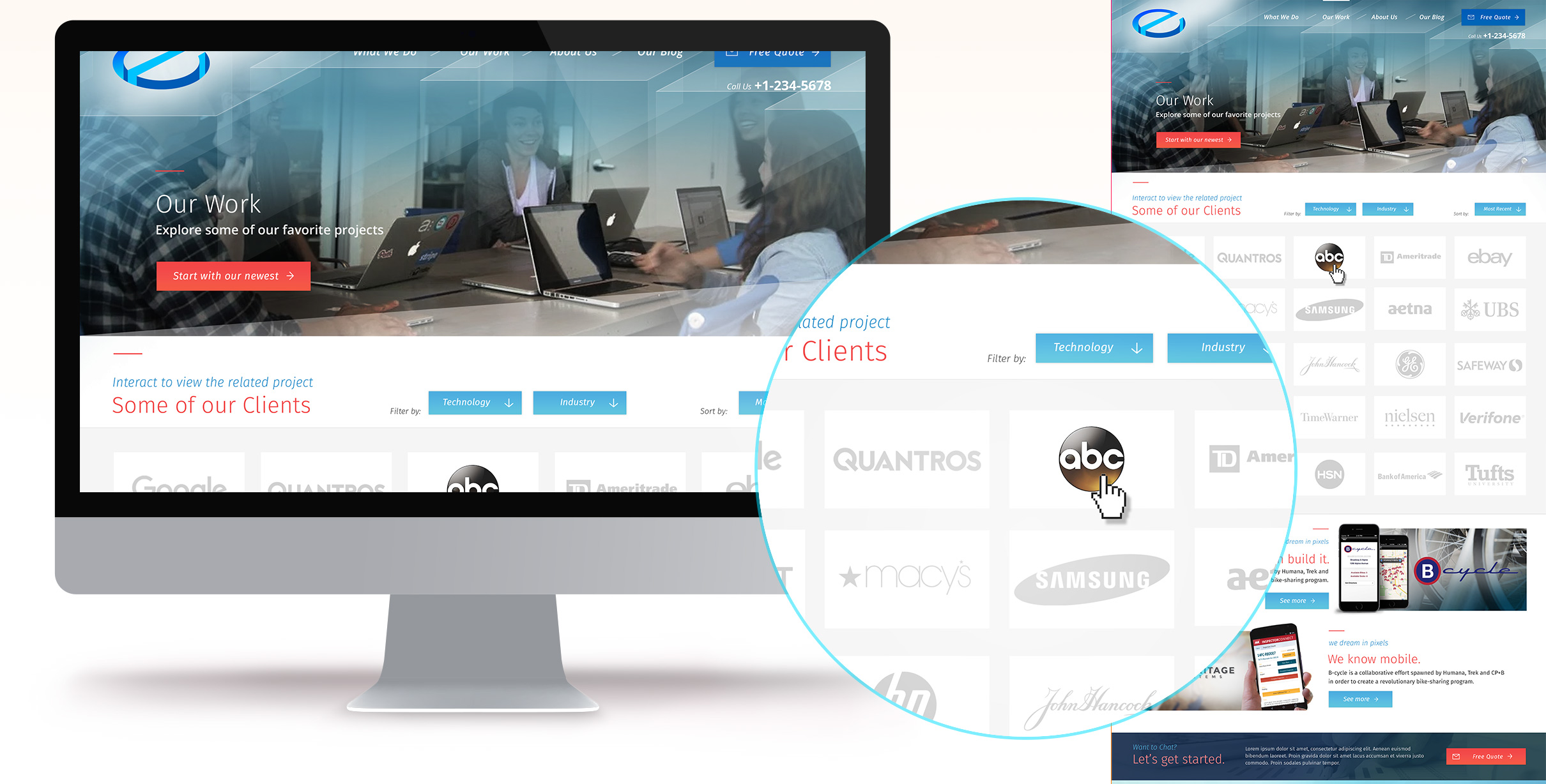
Case Studies - Our Work
Conceptually, we chose to marry our clients and our case studies. Here, on our Case Study or Work landing page, the User would be presented with a grid our clients - each representing a Case Study of a previous engagement or project.
I also envisioned the ability to filter and sort by aspects such as industries or technologies utilized within the projects.
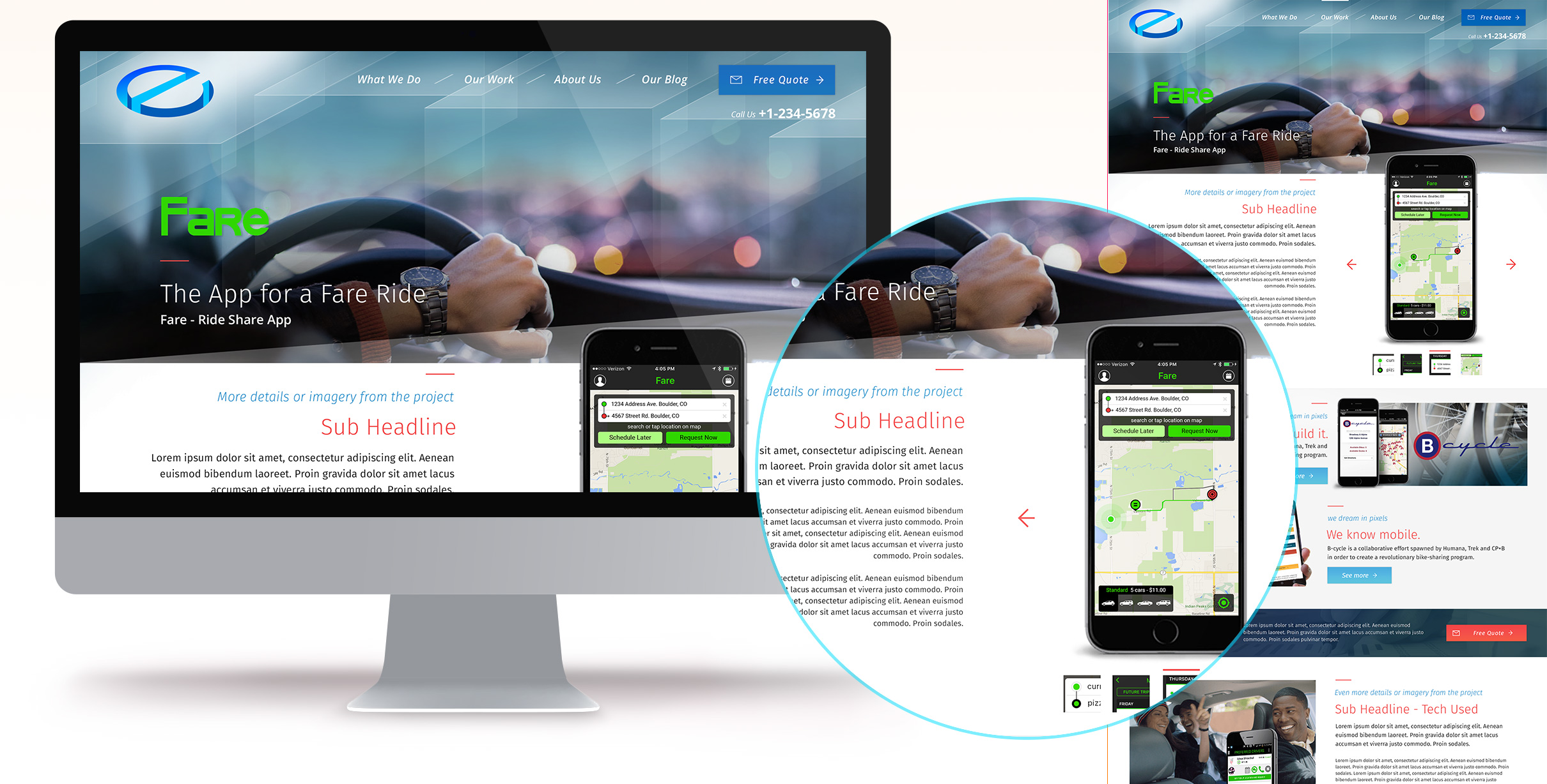
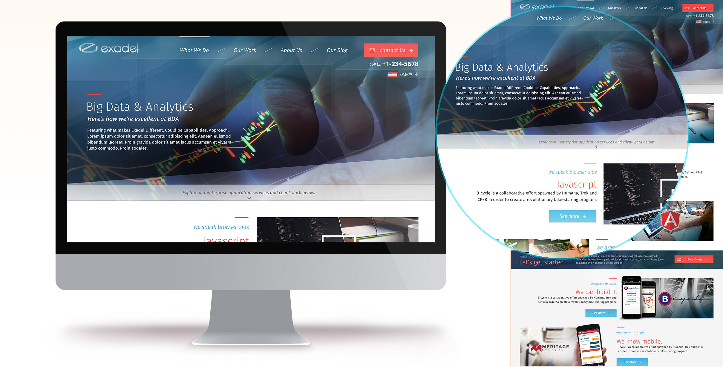
Case Study Detail
For these Success Stories the project needed to be the hero. Utilizing our background image structured header, imagery relative to the project could be pulled in.
As with software, sometimes imagery from the project itself is either unavailable or can't be shown. In those cases, our design and layout still needed to support a Story that may have been light or without project imagery.
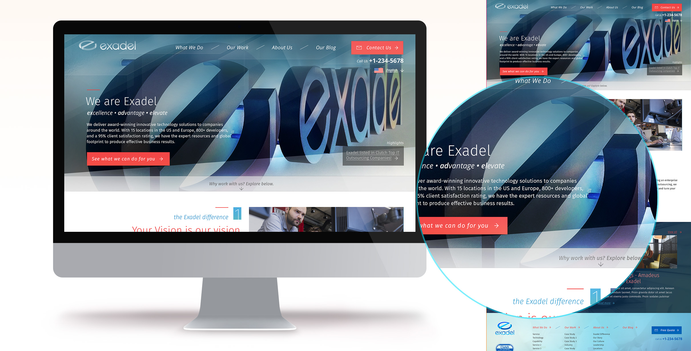
Final Design
After designing the complete site and page templates, I circled back around to the overall look and feel for one more pass.
I refined the grid and spacing while introducing a few more features, such as localization and a highlights widget for news and pr related items.
Most importantly with the final aesthetic passover, was pulling more of the header image forward - creating a more dynamic and impactful first impression for Users.
Final Design - Internal
Again, the background header imagery was shown in more vibrant detail.
Here, another new inclusion can be seen - a directional strip, pushing Users to continue reading more about the topic at hand below the header.
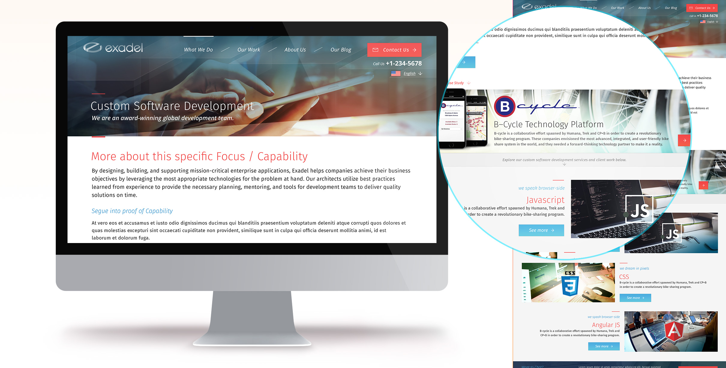
Final Design - Internal
Another variation of Internal Page template shown here, where more messaging and written content is needed.
Additionally, a variation of a Case Study detail can be seen - giving content managers the ability to highlight certain Sucesses even more.
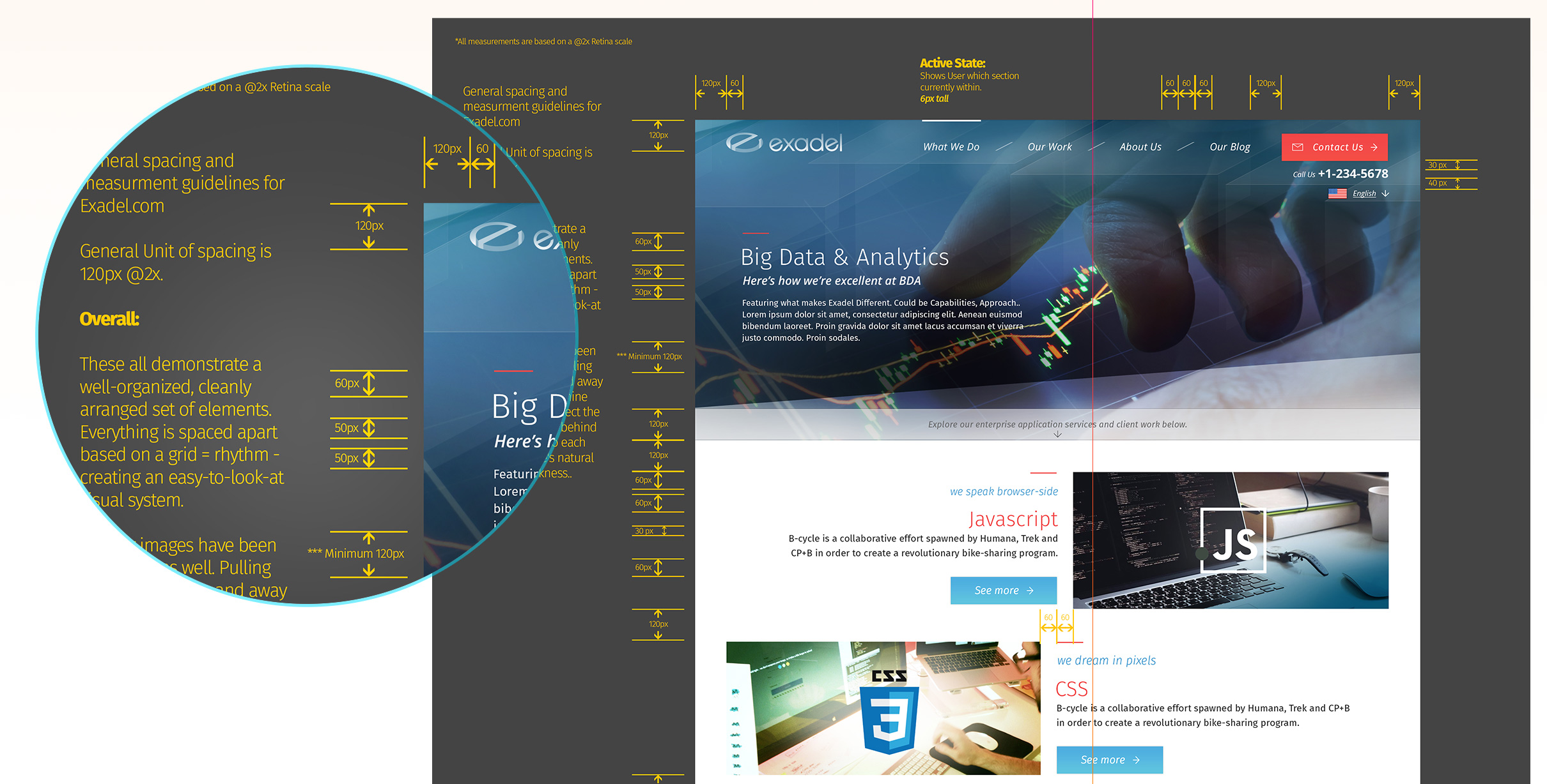
Front End Support
As Development began, I created some spatial guidelines for our Front End Team. These gave insight into the intended grid and spacing structure, which was critical to creating a clean, comfortable feeling overall look and feel.
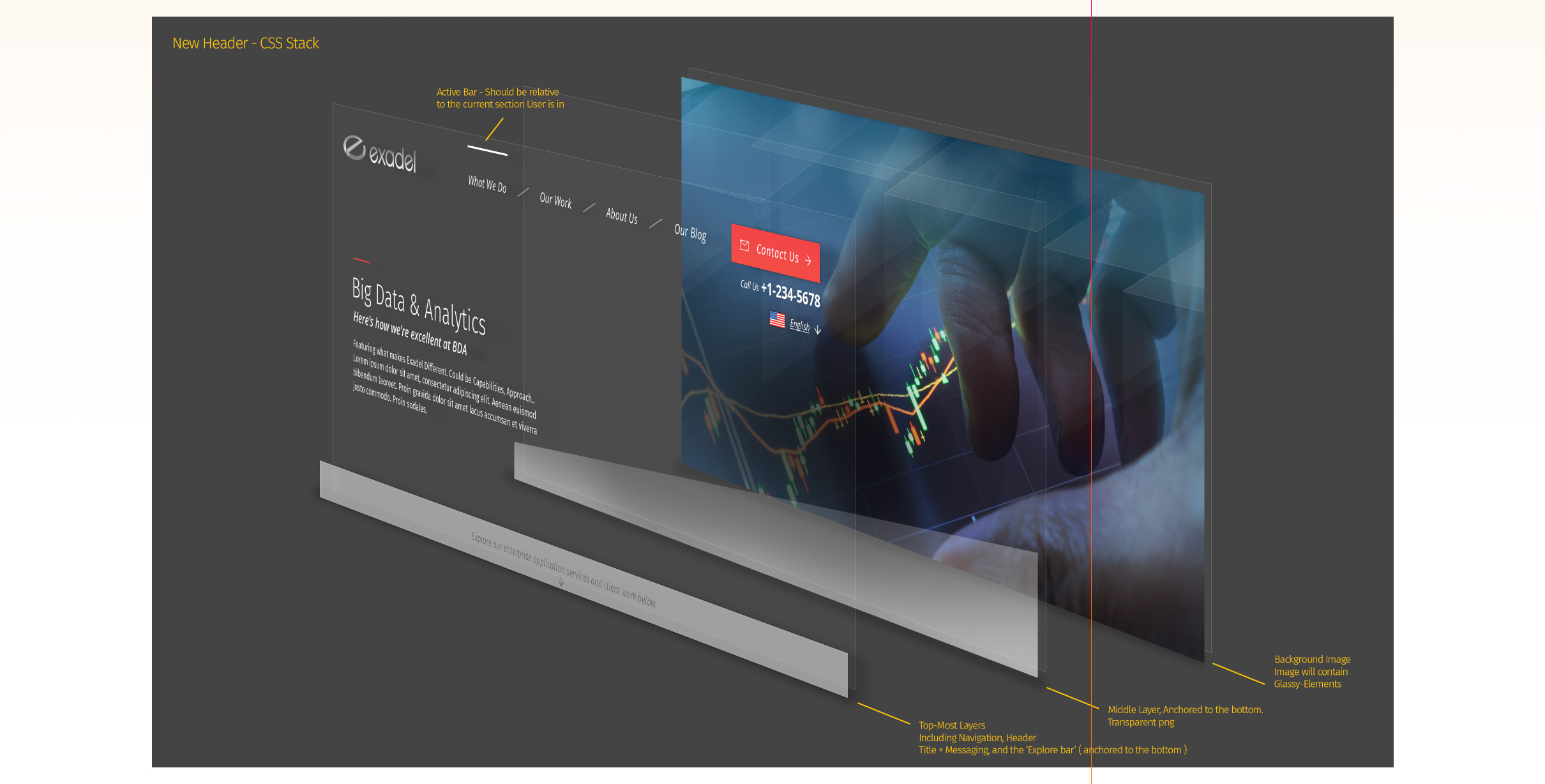
Front End Support cont.
In an effort to make development easier and more efficient, I included this example of how we could approach layering our headers in HTML and CSS, alleviating a good amount of effort on our development teams.

Selected work I've created
-
01 User Experience
- Gatorade - Sweat with the Best »
- Exadel - Responsive Redesign »
- Impact Journals - UX Redesign »
- Visit San Antonio - Tourism and Booking Web Platform »
-
02 Branding
- Exadel - Rebrand »
- Soapbox Marketing - Branding »
-
03 Product Design
- Voice - Blockchain Social Media »
- Verizon Wireless - Device Simulator »
- Undisclosed - Financial Enterprise App »
- FEMA - Community Rating System »
-
04 Usability
- Image Processing - Usability Study »
-
05 Visual / UI Design
- Mtn Dew - Gamer Hub »
- Vans Foods - Web Redesign »
- Mtn Dew - Assemble the Avengers »
-
06 Packaging Design
- Native Eyewear - Packaging Concepts »
- Mtn Dew - Spiked Lemonade »
-
07 Campaign Design
- 3M - Telecom Division »
- Mtn Dew - Black Label »

Some things I enjoy
Human Factors and Psychology, Ideation, Collaboration, UX Research, Strategy, User Personas, User Stories + Flows, Information Architecture, Wireframing / Prototyping, Art Direction, Mentoring / Teaching, Hierarchy, Visual Design, Leading Teams, Illustration, Conceptual Thinking, Live Music, Veggies, Beers, Hiking, And long walks on the beach.
You’ve reached the bottom, kudos. Jump to My Work, Learn About my Experience or Get in Touch. Perhaps, you'd like to return to the top?
© Tony Phillips