Recent work i've created
View all work »-
01 UX-Product Design
- Voice - Blockchain Social Media App »
- Gatorade - Sweat with the Best »
- Impact Journals - UX Redesign »
- Undisclosed - Financial Enterprise App »
-
02 Visual UI Design
- Mtn Dew - Gamer Hub »
- Vans Foods - Web Redesign »
- Mtn Dew - Assemble the Avengers »
About Me
View my full Experience »
-
I’m an enthusiastic design leader, passionate about everything from building teams to nerding out about human psychology. I'm experienced in all facets of Product Design and know what it takes to be a successful Design group within a software organization. I can illustrate. Present. Inspire. Evangelize. Mentor. Teach. I'm currently the Director of Product Design at Ozmo, growing a small but mighty design practice. ...read more
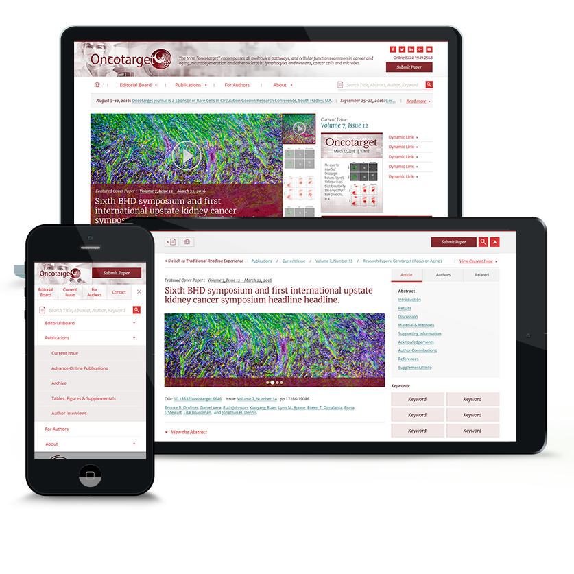
Impact Journals
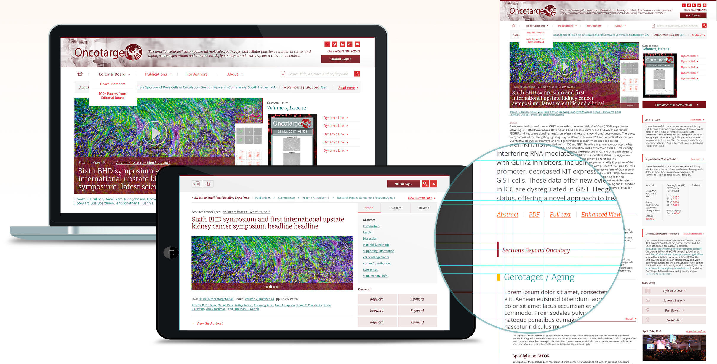
Impact Journals Responsive Website Redesign
UX Research and UX Design won this pitch. I encouraged bringing their articles up in emphasis, instead of buried in the site. I presented Research around what constitutes a readable online experience, helping them see the value in a clean, modern, open look and feel.
The goal was to attract both more readers and authors. After understanding more about their audience, I demonstrated value to their Users in context of making the content the hero, winning over both potential Authors and Readers.
I participated in every phase of this project - from pitching to working directly with the client to gather requirements and document them in the form of an extensive and robust Axure Prototype. After settling the Architecture, I worked frequently with Development to ensure and suggest a robust framework for catering the same structure to four variant Journal Brands.
My Role: UX Design, Creative Director, IA Architect, Art Direction, Usability Expert, Pitch Presenter
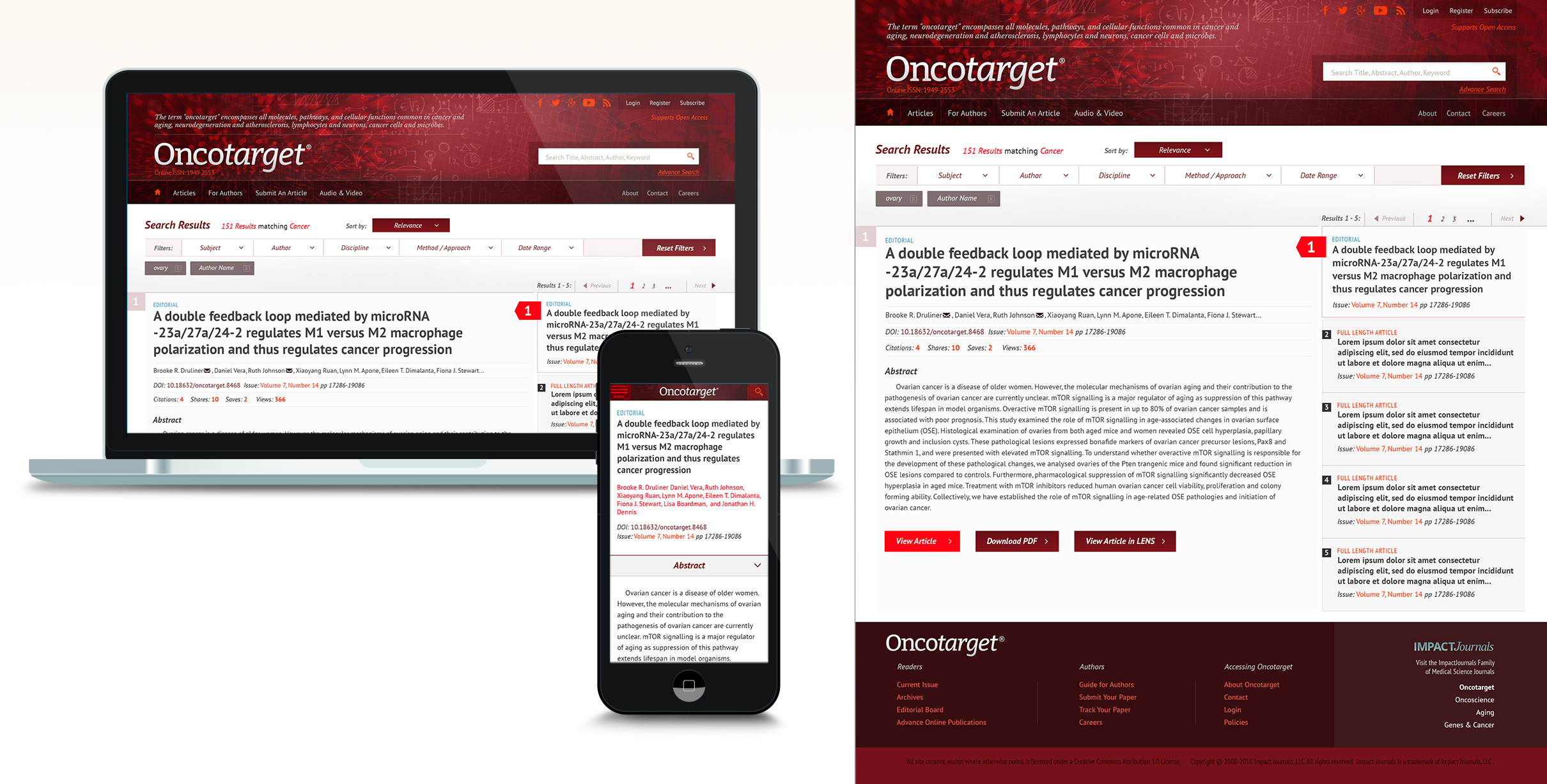
The Pitch
I delivered Research, insight and two robust Visual Designs, highlighting my recommendations. Priority on readability, and demonstrating the value inherent with the wealth of content available.
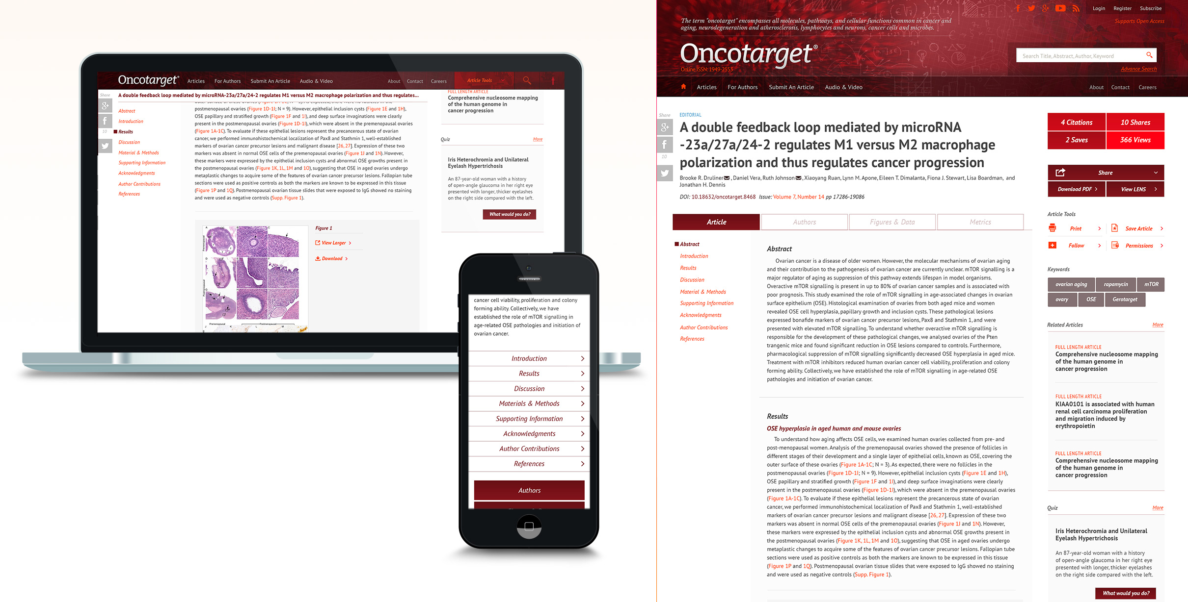
The Pitch - Article
The article, to me, was the crux of the whole experience. Both major sets of users relied on and needed the article as their biggest User Need from the Journal experience.
As part of my pitch, I pressed the importance and value inherent of this portion of content from the set of Journal websites. I tried to visualize and help demonstrate to the potential client that displaying the readable content in a clean, modern, navigable experience would boost readership and authorship.
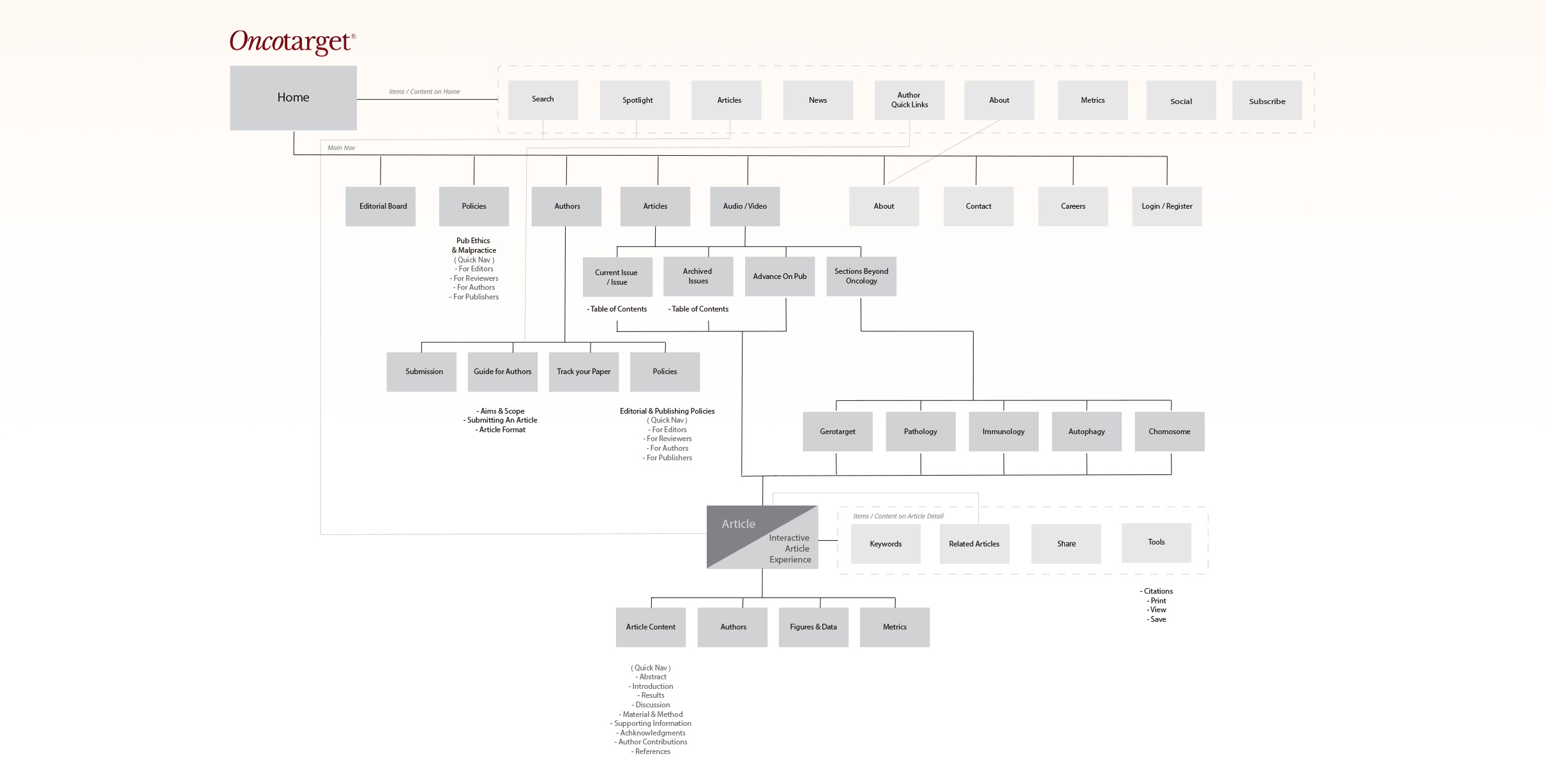
Information Architecture
As a first step in the process, I worked with the client to plot out the high-level design of the Journal system.
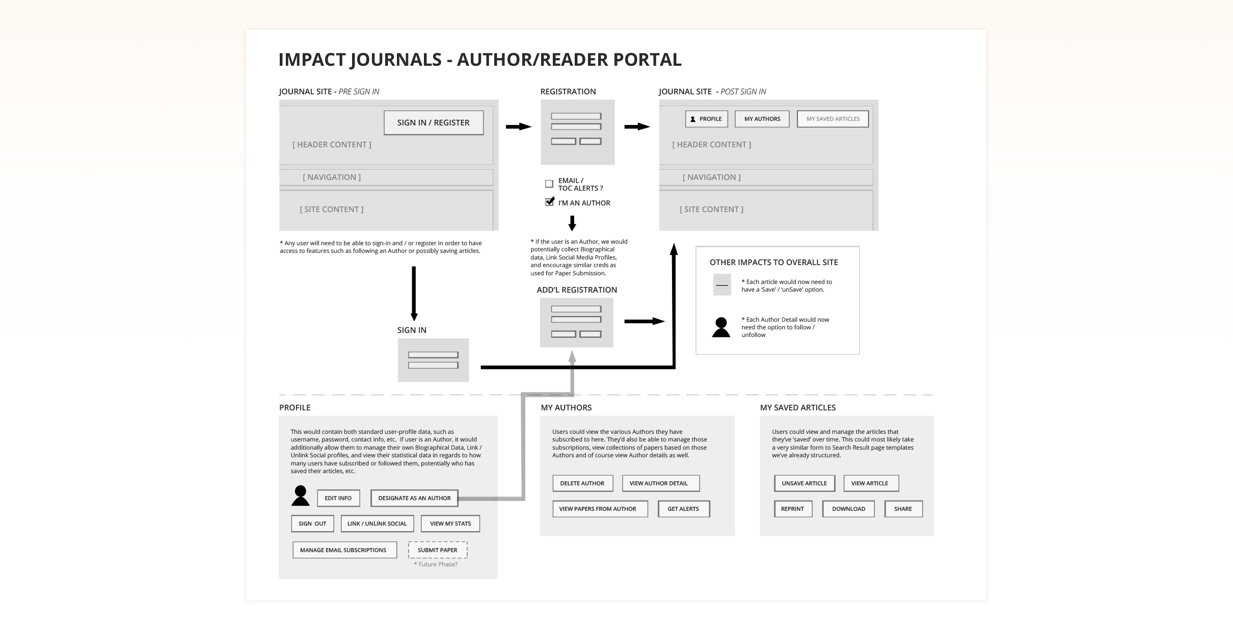
User Flows
An important part of the process was documenting specific flows and journeys with special subsections. As I gathered requirements, diagrams such as this helped as a means of ensuring I interpreted the client perfectly.
Here you can see a specific example of a User Flow, depicting a User's behavior through a potential Author Portal.
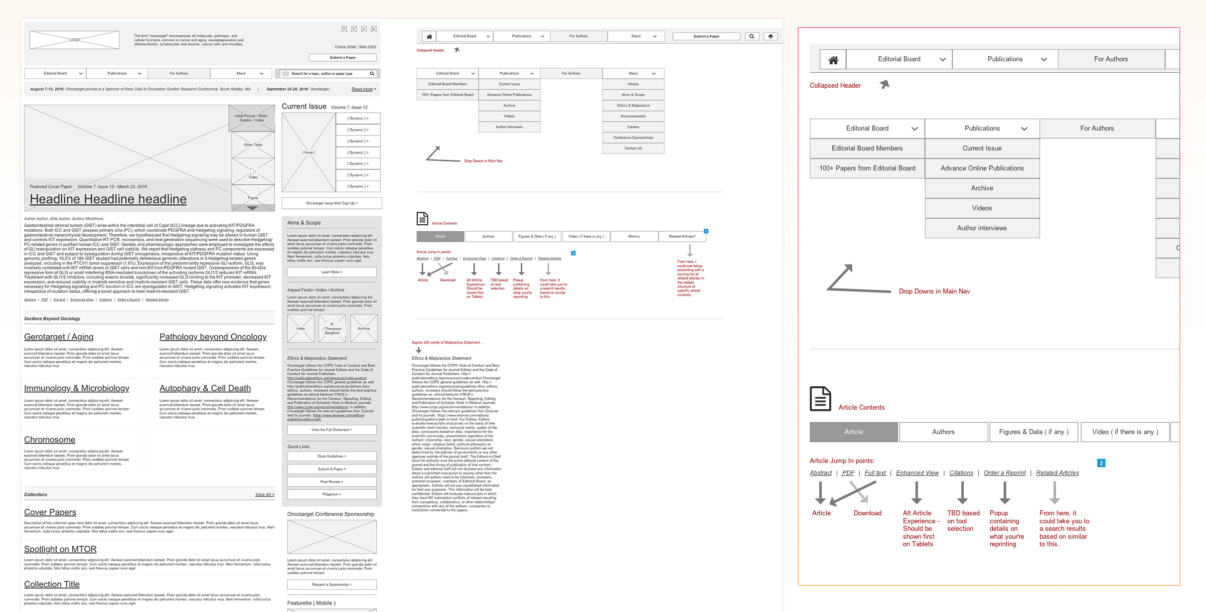
Wireframe Prototype
I approached a robust wireframe in Axure, documenting various views / sizes across devices for proper responsive considerations, in total reaching close to 50 screens.
Throughout the wireframing process, I interacted thouroughly with the client, plotting out every detail. Here you can see how I attempted to document considerations and notes, helping to define even more than just the structure itself.
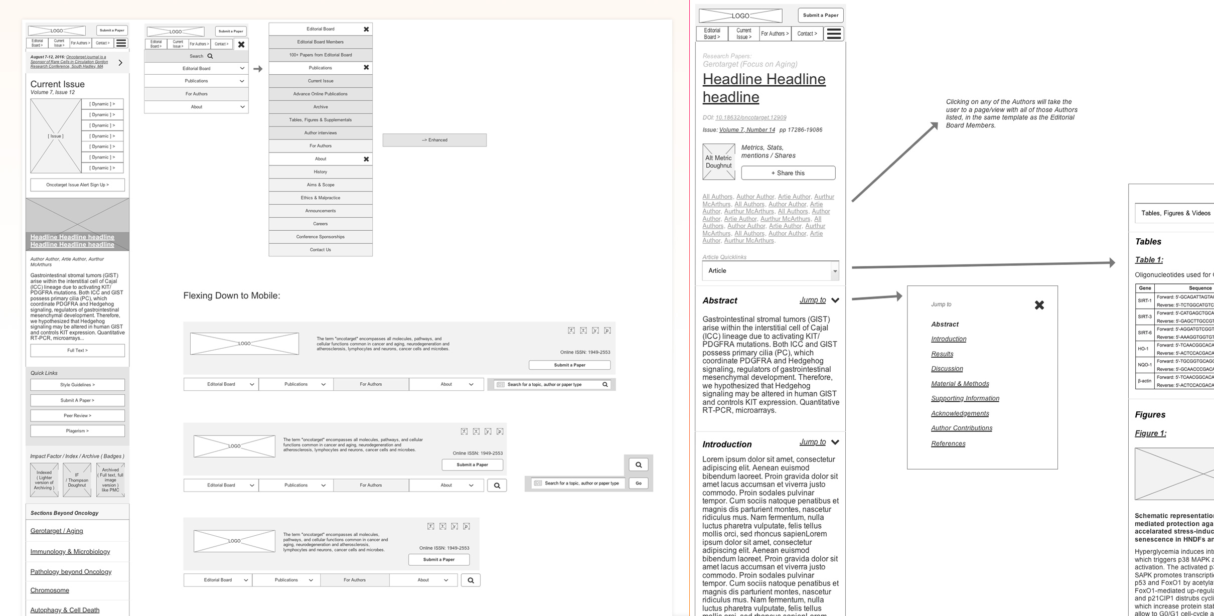
Wireframe Prototype - Responsive Considerations
For this robust set of Axure Wireframes, I also plotted out any and all responsive considerations.
Again, documenting and describing things in detail kept myself and the client on the same page throughout the entire process.
Final Design
The final design was similar to one of the concepts originally pitched. It was clean, modern and felt scholarly.
In design process, I always utilize grids and evenly spaced designed. Creating a Vertical Rhythm in interactive design is critical as the sense of spaciousness makes users feel comfortable and want to remain longer.
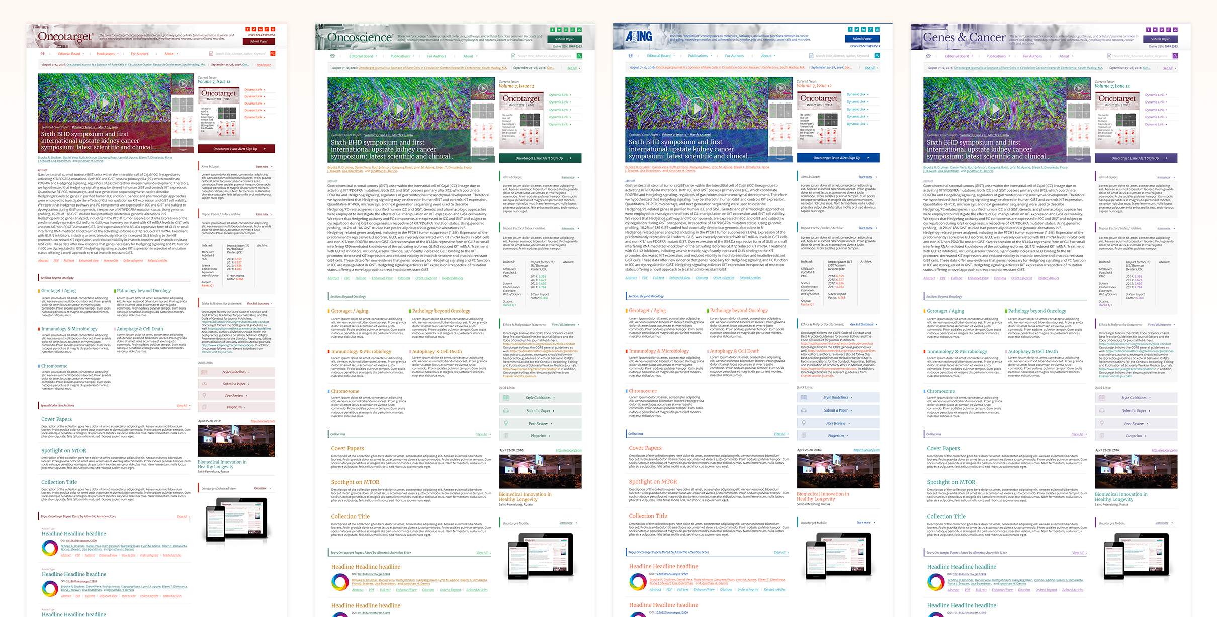
Final Design - Identity UI System
The final design utilized Brand and color variations for four different Journals, applying a smart CSS shift across one code base and architecture.

Selected work I've created
-
01 User Experience
- Gatorade - Sweat with the Best »
- Exadel - Responsive Redesign »
- Impact Journals - UX Redesign »
- Visit San Antonio - Tourism and Booking Web Platform »
-
02 Branding
- Exadel - Rebrand »
- Soapbox Marketing - Branding »
-
03 Product Design
- Voice - Blockchain Social Media »
- Verizon Wireless - Device Simulator »
- Undisclosed - Financial Enterprise App »
- FEMA - Community Rating System »
-
04 Usability
- Image Processing - Usability Study »
-
05 Visual / UI Design
- Mtn Dew - Gamer Hub »
- Vans Foods - Web Redesign »
- Mtn Dew - Assemble the Avengers »
-
06 Packaging Design
- Native Eyewear - Packaging Concepts »
- Mtn Dew - Spiked Lemonade »
-
07 Campaign Design
- 3M - Telecom Division »
- Mtn Dew - Black Label »

Some things I enjoy
Human Factors and Psychology, Ideation, Collaboration, UX Research, Strategy, User Personas, User Stories + Flows, Information Architecture, Wireframing / Prototyping, Art Direction, Mentoring / Teaching, Hierarchy, Visual Design, Leading Teams, Illustration, Conceptual Thinking, Live Music, Veggies, Beers, Hiking, And long walks on the beach.
You’ve reached the bottom, kudos. Jump to My Work, Learn About my Experience or Get in Touch. Perhaps, you'd like to return to the top?
© Tony Phillips