Recent work i've created
View all work »-
01 UX-Product Design
- Voice - Blockchain Social Media App »
- Gatorade - Sweat with the Best »
- Impact Journals - UX Redesign »
- Undisclosed - Financial Enterprise App »
-
02 Visual UI Design
- Mtn Dew - Gamer Hub »
- Vans Foods - Web Redesign »
- Mtn Dew - Assemble the Avengers »
About Me
View my full Experience »
-
I’m an enthusiastic design leader, passionate about everything from building teams to nerding out about human psychology. I'm experienced in all facets of Product Design and know what it takes to be a successful Design group within a software organization. I can illustrate. Present. Inspire. Evangelize. Mentor. Teach. I'm currently the Director of Product Design at Ozmo, growing a small but mighty design practice. ...read more

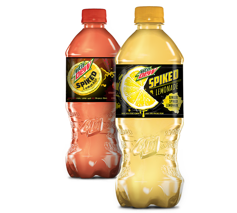
Mtn Dew
Spiked Lemonade
Mtn Dew had a new flavor down the pipeline, Spiked Lemonade. Of course with Dew, nothing can look tame or unadventurous. With two variations of the Lemonade flavor, I had two color profiles to work with for the labels. I intended to lean into the spiked aspect of the flavor heavily and create something that felt electric.
My Role: Art Direction, Conceptual Thinker, Packaging Design
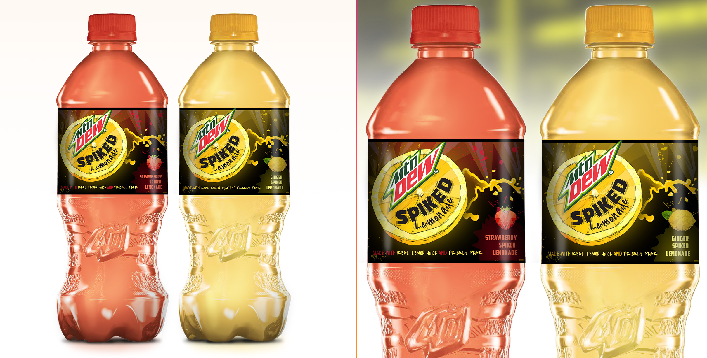
Label Concept 1
For this concept I approached a sketchy, illustrative style - focused around a lemon slice that appeared as though it were flying across the space. The lemon wedge also resembled and paired well with some recent Mtn Dew brand elements, geometric diagonal shapes, that are shown in the background.
The layout leaves a nice space for the flavor profile and name to be shown on the label, fitting nicely in the bottom right of the design.
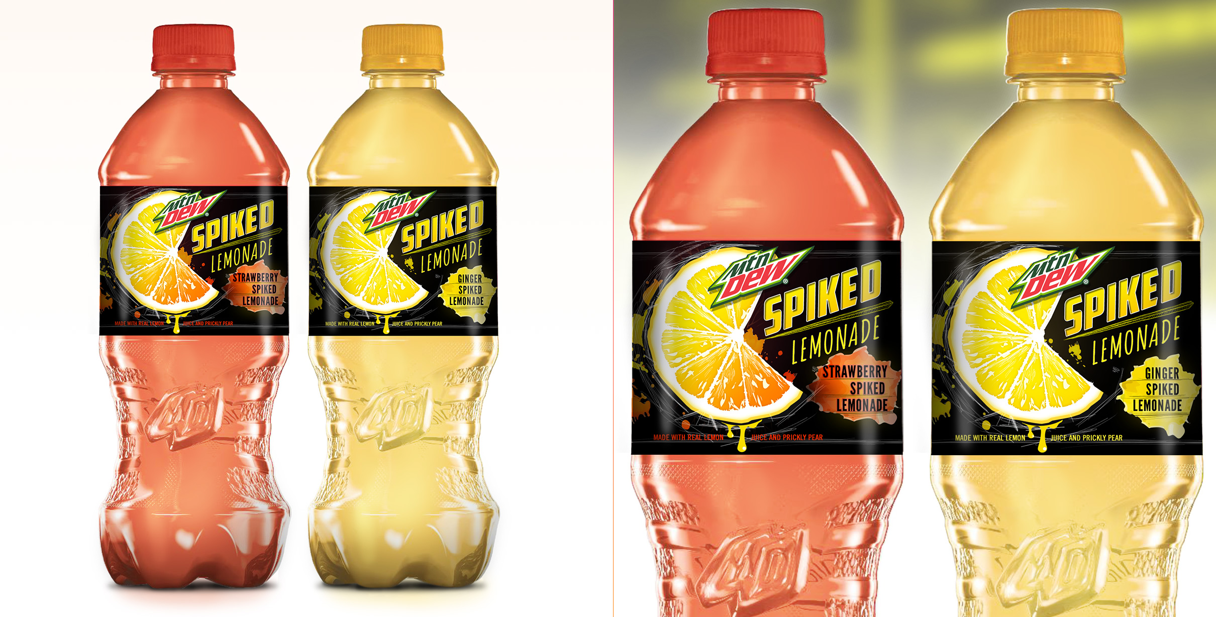
Label Concept 2
For the second concept, again I used a lemon slice, but this version was a little more realistically rendered. The visuals were still brought up in drama with increased contrast and dripping lemon juice.

Selected work I've created
-
01 User Experience
- Gatorade - Sweat with the Best »
- Exadel - Responsive Redesign »
- Impact Journals - UX Redesign »
- Visit San Antonio - Tourism and Booking Web Platform »
-
02 Branding
- Exadel - Rebrand »
- Soapbox Marketing - Branding »
-
03 Product Design
- Voice - Blockchain Social Media »
- Verizon Wireless - Device Simulator »
- Undisclosed - Financial Enterprise App »
- FEMA - Community Rating System »
-
04 Usability
- Image Processing - Usability Study »
-
05 Visual / UI Design
- Mtn Dew - Gamer Hub »
- Vans Foods - Web Redesign »
- Mtn Dew - Assemble the Avengers »
-
06 Packaging Design
- Native Eyewear - Packaging Concepts »
- Mtn Dew - Spiked Lemonade »
-
07 Campaign Design
- 3M - Telecom Division »
- Mtn Dew - Black Label »

Some things I enjoy
Human Factors and Psychology, Ideation, Collaboration, UX Research, Strategy, User Personas, User Stories + Flows, Information Architecture, Wireframing / Prototyping, Art Direction, Mentoring / Teaching, Hierarchy, Visual Design, Leading Teams, Illustration, Conceptual Thinking, Live Music, Veggies, Beers, Hiking, And long walks on the beach.
You’ve reached the bottom, kudos. Jump to My Work, Learn About my Experience or Get in Touch. Perhaps, you'd like to return to the top?
© Tony Phillips