Recent work i've created
View all work »-
01 UX-Product Design
- Voice - Blockchain Social Media App »
- Gatorade - Sweat with the Best »
- Impact Journals - UX Redesign »
- Undisclosed - Financial Enterprise App »
-
02 Visual UI Design
- Mtn Dew - Gamer Hub »
- Vans Foods - Web Redesign »
- Mtn Dew - Assemble the Avengers »
About Me
View my full Experience »
-
I’m an enthusiastic design leader, passionate about everything from building teams to nerding out about human psychology. I'm experienced in all facets of Product Design and know what it takes to be a successful Design group within a software organization. I can illustrate. Present. Inspire. Evangelize. Mentor. Teach. I'm currently the Director of Product Design at Ozmo, growing a small but mighty design practice. ...read more
Soapbox
A new Brand for a new Marketing Company
A newly formed marketing company needed an identity and logo as they got off the ground.
I took on the assignment and lead the small company through some typical discovery exercises to help identify what their brand meant and could look like.
My Role: Creative Director, Brand Designer, Art Director
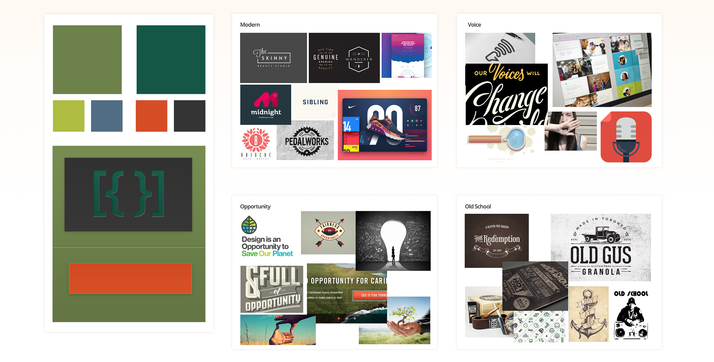
Inspiration / Mood Exercise
One exercise that enabled both myself and the client to quickly move through ideation was an inspiration board or mood board exploration.
I gathered examples that fit spaces the client identified as core to their goals and ideals as a new company.
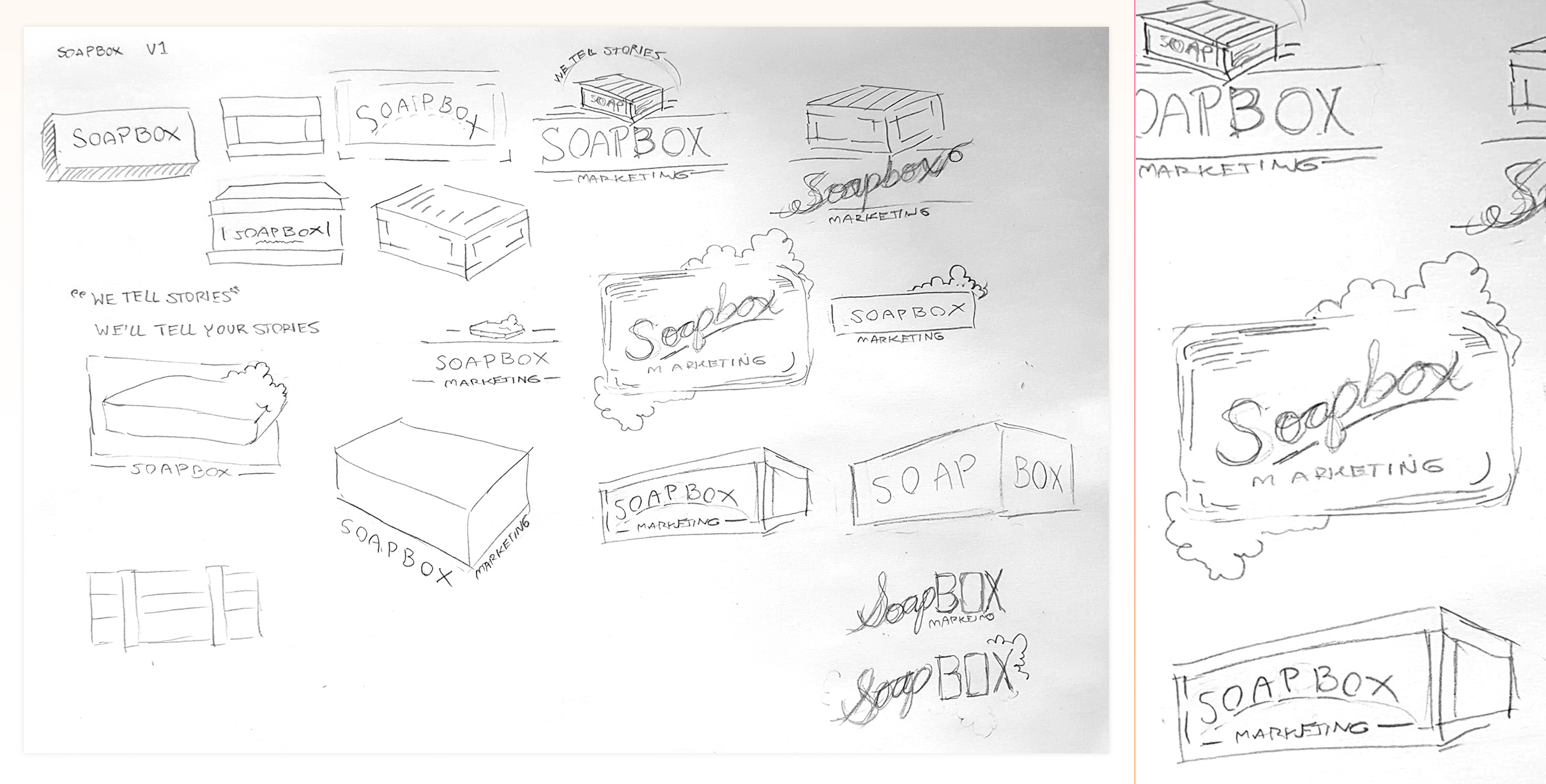
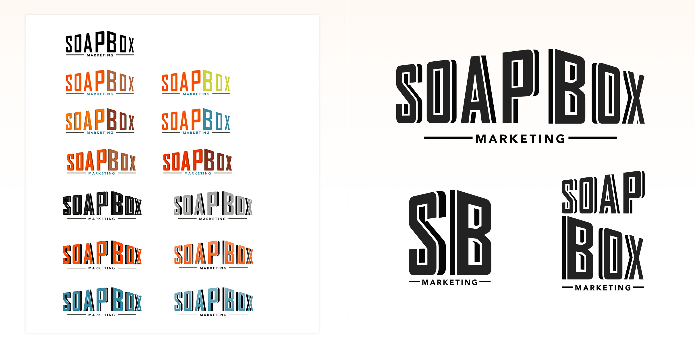
Logo Ideation
I quickly sketched and generated multitudes of ideas and explorations, eventually reigning in my ideas to smalled subset, seen here.
The brand and name, Soapbox, had some inherent visual collateral that could be used if the right concoction could be created.
I experimented heavily with the literal idea of a soapbox - which orators traditionally stood on to speak to a crowd.
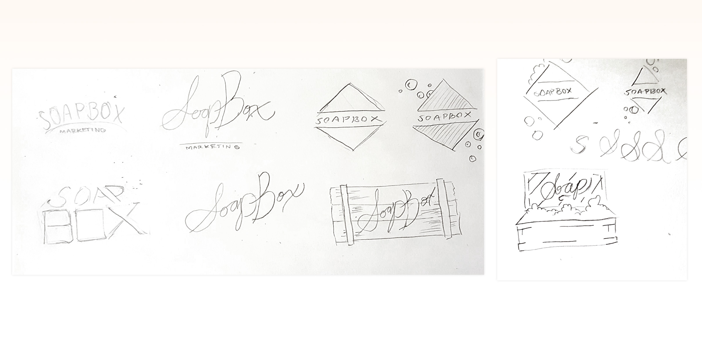
Additional Logo Ideation
After reviewing the first finalized set of ideas with the client, I jumped back into sketching and ideation just to offer due dilligence in exploration.
The second round became just as fruitful as the first.
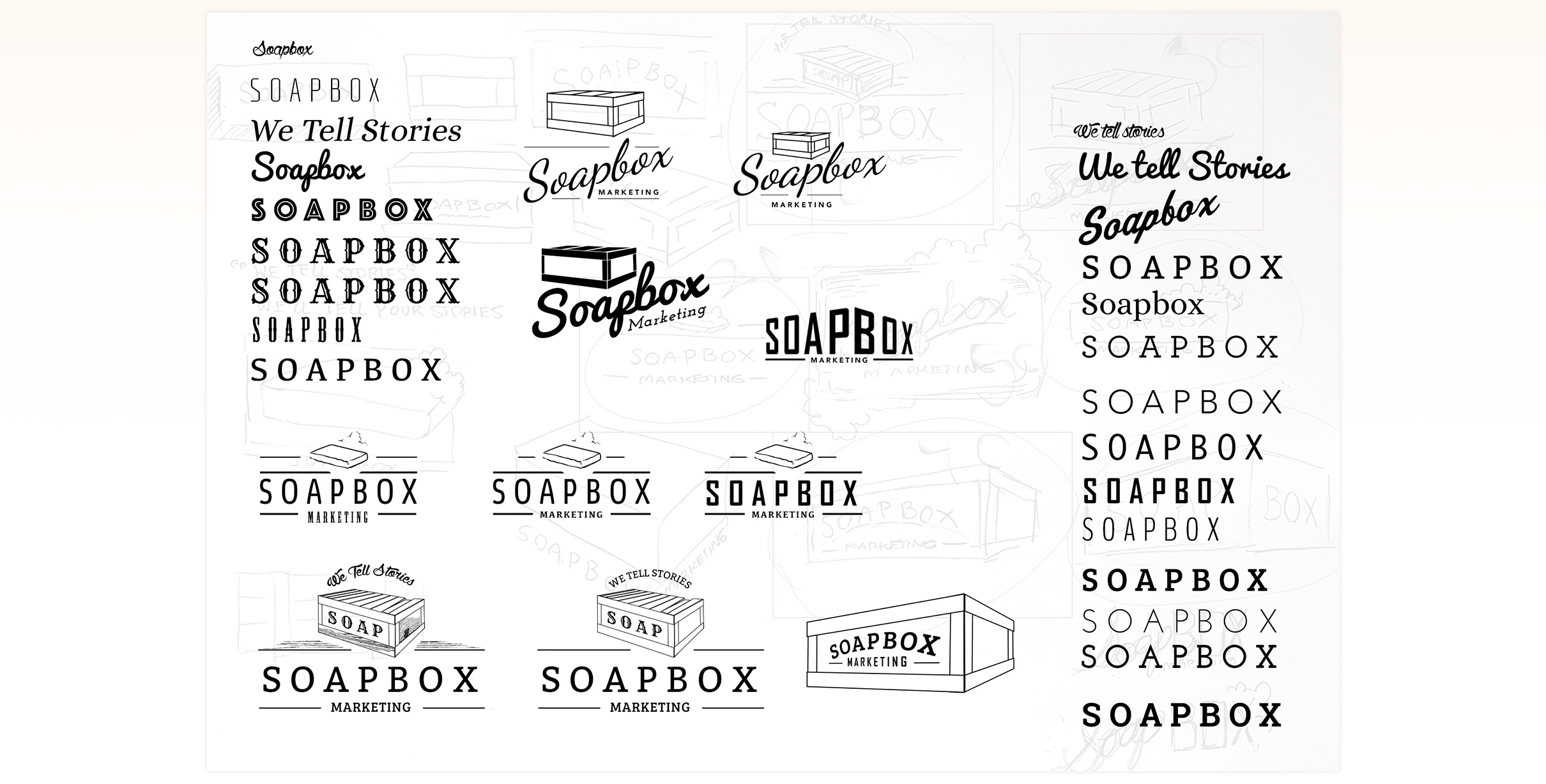
Iterations
After sketching and rough concepting, I moved into the digital space and began iterating on concepts within Adobe Illustrator.
Here you can also see I began exploring typography as well.
Final 2 - Literal Concept
This concept leaned more heavily into literal territory, but brought to life a modern feeling logo that felt interesting and hip.
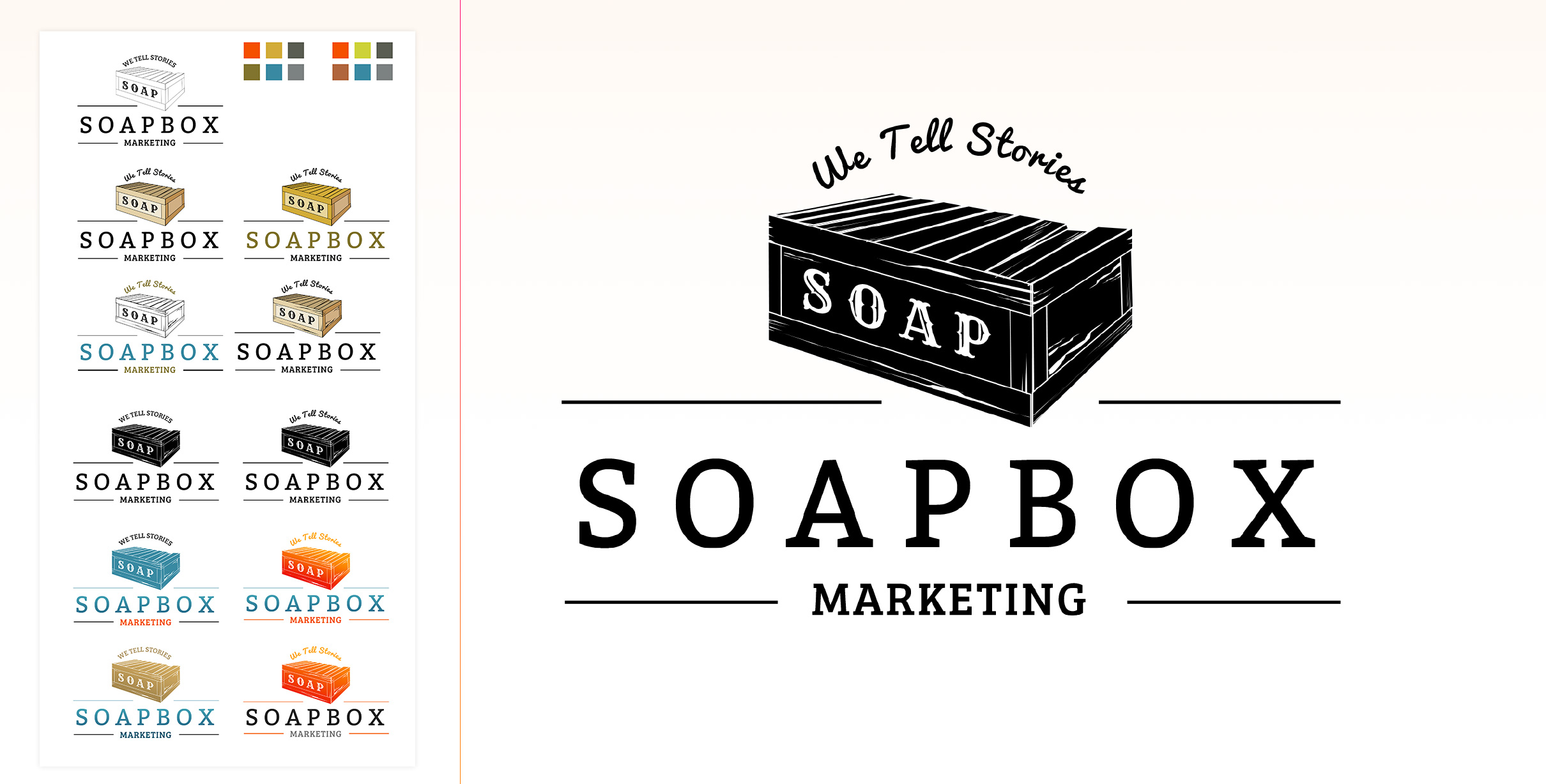
Final 2 - Dimensional Concept
This concept relied more on the dimensionality of a box - combining both that and the wordmark itself resulted in this, ultimately the client's chosen direction.
I also created vertical versions of the logo, accounting for uses in potentially more difficult spaces.
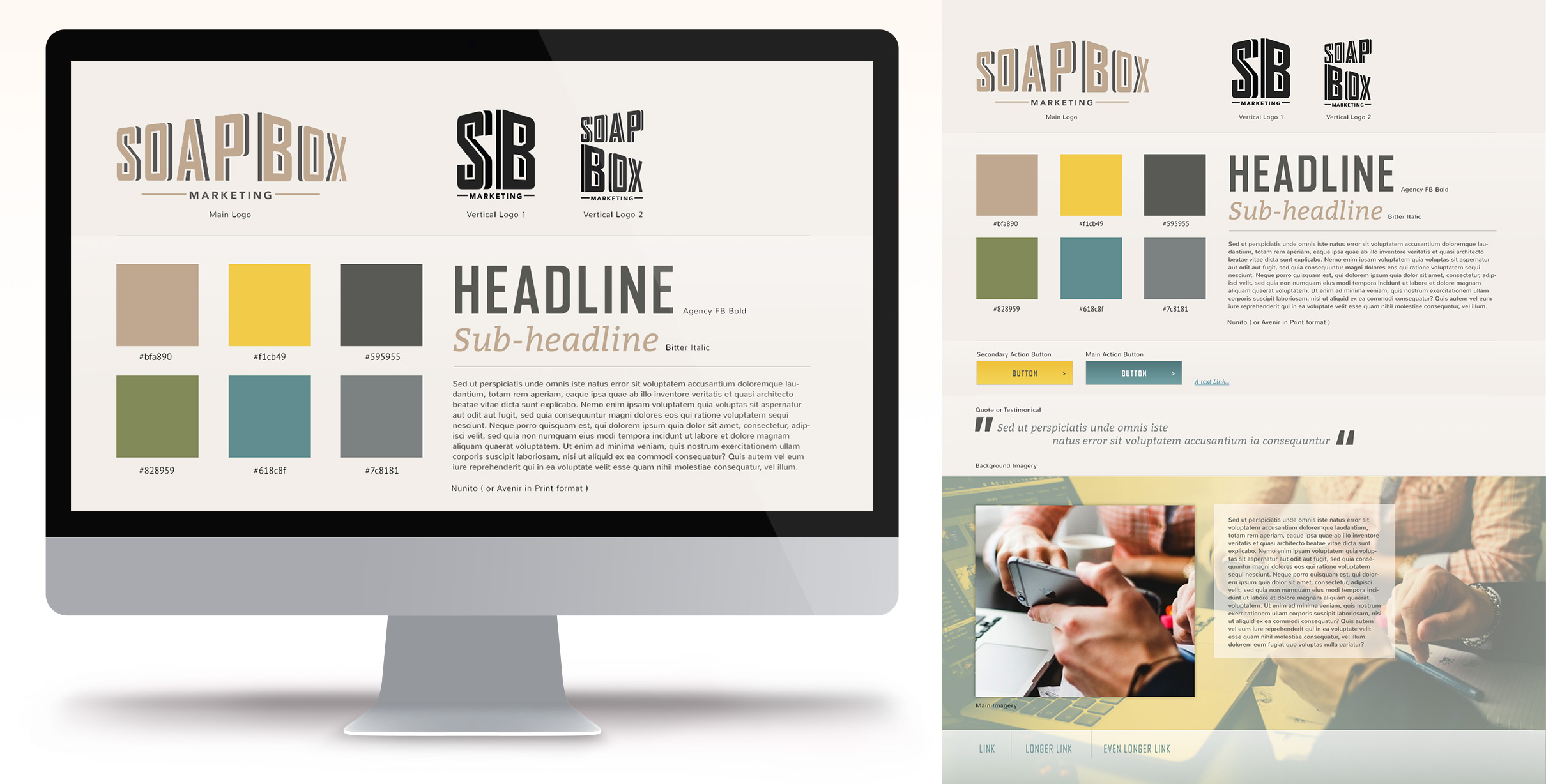
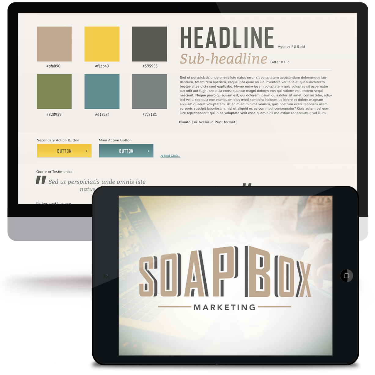
Final Concept and Style Guide
After selecting the final concept, I quickly worked with the client to develop a style guide for handoff, identifying a color palette, typography suggestions and some ideas of UI solutions.

Selected work I've created
-
01 User Experience
- Gatorade - Sweat with the Best »
- Exadel - Responsive Redesign »
- Impact Journals - UX Redesign »
- Visit San Antonio - Tourism and Booking Web Platform »
-
02 Branding
- Exadel - Rebrand »
- Soapbox Marketing - Branding »
-
03 Product Design
- Voice - Blockchain Social Media »
- Verizon Wireless - Device Simulator »
- Undisclosed - Financial Enterprise App »
- FEMA - Community Rating System »
-
04 Usability
- Image Processing - Usability Study »
-
05 Visual / UI Design
- Mtn Dew - Gamer Hub »
- Vans Foods - Web Redesign »
- Mtn Dew - Assemble the Avengers »
-
06 Packaging Design
- Native Eyewear - Packaging Concepts »
- Mtn Dew - Spiked Lemonade »
-
07 Campaign Design
- 3M - Telecom Division »
- Mtn Dew - Black Label »

Some things I enjoy
Human Factors and Psychology, Ideation, Collaboration, UX Research, Strategy, User Personas, User Stories + Flows, Information Architecture, Wireframing / Prototyping, Art Direction, Mentoring / Teaching, Hierarchy, Visual Design, Leading Teams, Illustration, Conceptual Thinking, Live Music, Veggies, Beers, Hiking, And long walks on the beach.
You’ve reached the bottom, kudos. Jump to My Work, Learn About my Experience or Get in Touch. Perhaps, you'd like to return to the top?
© Tony Phillips