Recent work i've created
View all work »-
01 UX-Product Design
- Voice - Blockchain Social Media App »
- Gatorade - Sweat with the Best »
- Impact Journals - UX Redesign »
- Undisclosed - Financial Enterprise App »
-
02 Visual UI Design
- Mtn Dew - Gamer Hub »
- Vans Foods - Web Redesign »
- Mtn Dew - Assemble the Avengers »
About Me
View my full Experience »
-
I’m an enthusiastic design leader, passionate about everything from building teams to nerding out about human psychology. I'm experienced in all facets of Product Design and know what it takes to be a successful Design group within a software organization. I can illustrate. Present. Inspire. Evangelize. Mentor. Teach. I'm currently the Director of Product Design at Ozmo, growing a small but mighty design practice. ...read more

Vans Foods
 Back to all Work
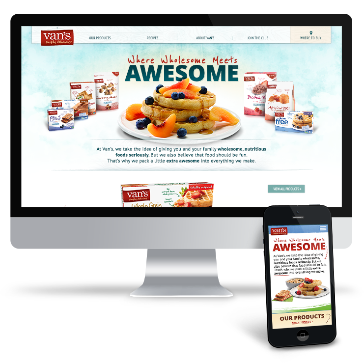
Vans Foods Website Redesign
As the lead on the Vans account, I was tasked with approaching a new design for Vans' Website - bringing it into responsive territory and relying on more current best practices.
The overal vision and tone of Vans was to become more and more approachable, enticing and centering engagement around their delightful and tasty products.
My Role: UX Design, IA Architect, Art Direction, Usability Expert
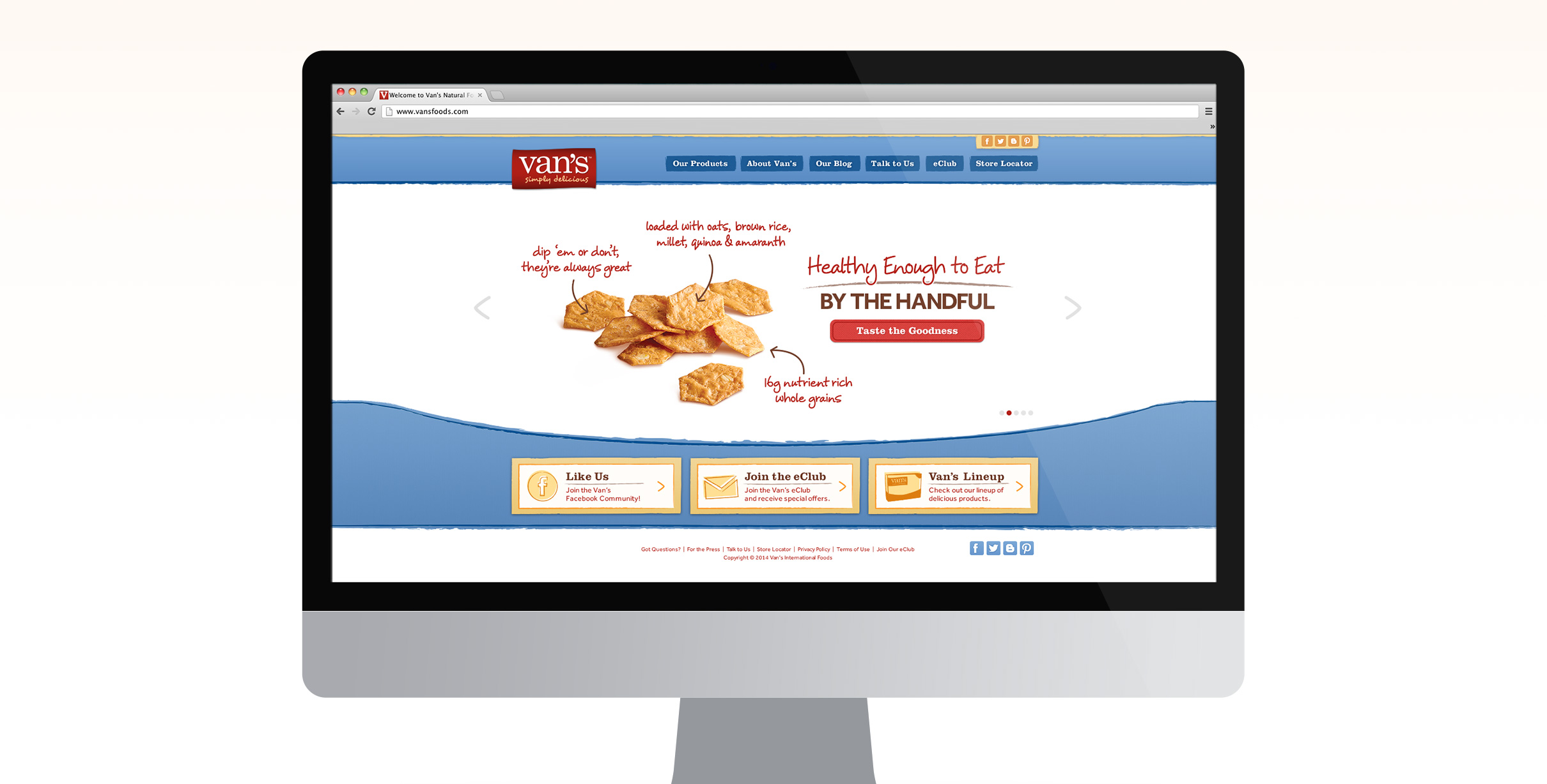
The previous, non-responsive website
The former Vans Foods website was unresponsive and dated in look and feel. As the overall brand looked to reinvent its idenity into something more modern, of course the website needed a facelift in both appearance and usability.
First Visual Design Concept
Both of my two concepts relied heavily on shots of Vans Foods products, heroizing the delightful food itself. With a color pallete centered around the red of the Vans logo, and the generally brown toned waffles and many other breakfast products, I chose to pull in some bright and lite blues to help brighten the overall look and feel.
This first concept felt fresh and bright. I pulled in some notes of wood grain and kept some remnants of previous styles - sketchy lines and a hand-drawn effect. This helped to keep some of the playfulness of the brand, which was important.
Alternate Visual Design Concept
For the second concept, I leaned into more textural background noise and variations of colors to create a more comfortable and playful design style.
The overall effect was still warm, inviting and fun. The colors in this concept had the potential to be used for categorical recognition - allowing for certain topics or focuses to be identified by their colors.
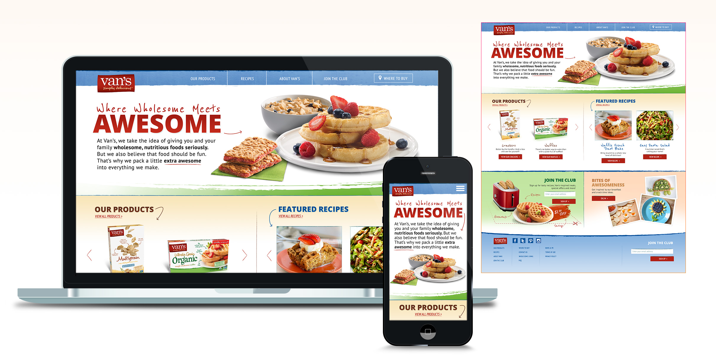
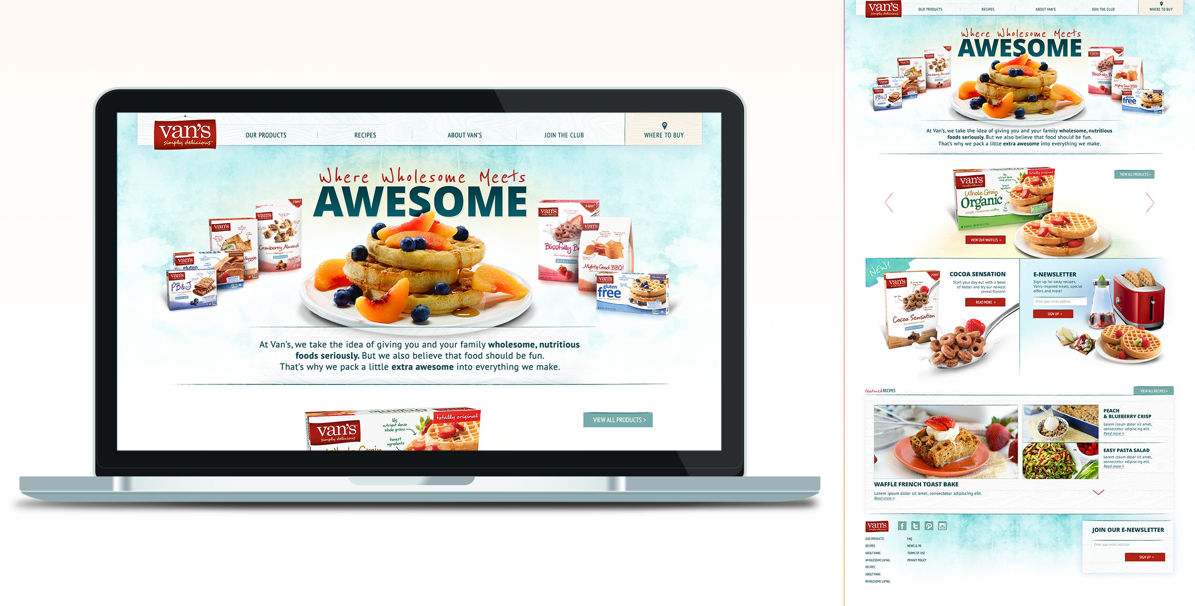
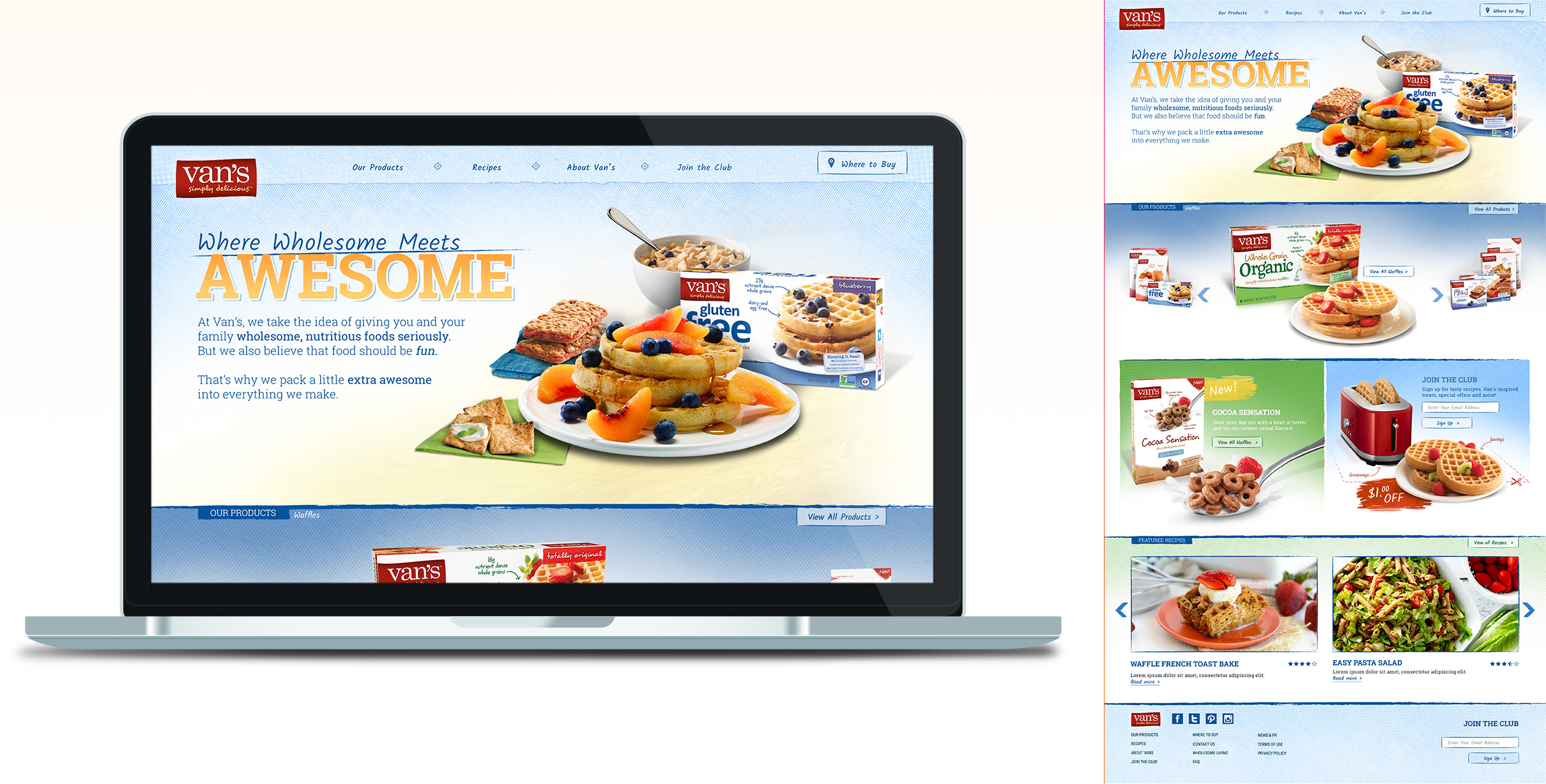
Final Responsive Design
The final approach neared something more familiar for the brand. It encompassed aspects of the second concept in color considerations, but edged slightly more back towards the former design.
Of course, this updated look still included the UX and Usability considerations I originally recommended for the update.
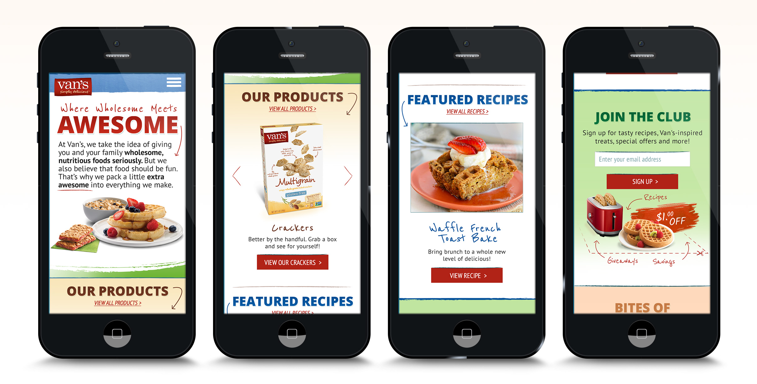
Final Responsive Design - Mobile
The final design could flex and respond to all device sizes easily. Shifting to a single column for mobile was natural for this design - which was an important missing peice from the current, existing site - especially considering their audience was heavy mobile users.

Selected work I've created
-
01 User Experience
- Gatorade - Sweat with the Best »
- Exadel - Responsive Redesign »
- Impact Journals - UX Redesign »
- Visit San Antonio - Tourism and Booking Web Platform »
-
02 Branding
- Exadel - Rebrand »
- Soapbox Marketing - Branding »
-
03 Product Design
- Voice - Blockchain Social Media »
- Verizon Wireless - Device Simulator »
- Undisclosed - Financial Enterprise App »
- FEMA - Community Rating System »
-
04 Usability
- Image Processing - Usability Study »
-
05 Visual / UI Design
- Mtn Dew - Gamer Hub »
- Vans Foods - Web Redesign »
- Mtn Dew - Assemble the Avengers »
-
06 Packaging Design
- Native Eyewear - Packaging Concepts »
- Mtn Dew - Spiked Lemonade »
-
07 Campaign Design
- 3M - Telecom Division »
- Mtn Dew - Black Label »

Some things I enjoy
Human Factors and Psychology, Ideation, Collaboration, UX Research, Strategy, User Personas, User Stories + Flows, Information Architecture, Wireframing / Prototyping, Art Direction, Mentoring / Teaching, Hierarchy, Visual Design, Leading Teams, Illustration, Conceptual Thinking, Live Music, Veggies, Beers, Hiking, And long walks on the beach.
You’ve reached the bottom, kudos. Jump to My Work, Learn About my Experience or Get in Touch. Perhaps, you'd like to return to the top?
© Tony Phillips