Recent work i've created
View all work »-
01 UX-Product Design
- Voice - Blockchain Social Media App »
- Gatorade - Sweat with the Best »
- Impact Journals - UX Redesign »
- Undisclosed - Financial Enterprise App »
-
02 Visual UI Design
- Mtn Dew - Gamer Hub »
- Vans Foods - Web Redesign »
- Mtn Dew - Assemble the Avengers »
About Me
View my full Experience »
-
I’m an enthusiastic design leader, passionate about everything from building teams to nerding out about human psychology. I'm experienced in all facets of Product Design and know what it takes to be a successful Design group within a software organization. I can illustrate. Present. Inspire. Evangelize. Mentor. Teach. I'm currently the Director of Product Design at Ozmo, growing a small but mighty design practice. ...read more
Visit San Antonio
The Social Tourism Experience
A ground-up redesign of San Antonio's travel and tourism website offered a wealth of opportunity for improvement. Extensive User Experience and Architectural studies were done to determine the most innovative ways of approaching tourism, and offering a social experience surrounding planning your next trip to San Antonio.
The goal was not only to provide Users what they'd expect to find from a Tourism website, but also delight them with abilities to plan, favorite and manage trips and activities. On top of that, we built in a social layer, encouraging Users to share their trips plans, enticing others to join in on the fun in San Antonio.
As the Lead Digital Art Director, I worked rapidly through the UX and IA process, plotting out a robust architecture. I served as the UX Designer, Visual Designer, Art Director and liaison to the Front End Development Team - guiding the experience into development.
My Role: UX Design, IA Architect, Art Direction, Usability Expert, Visual Design
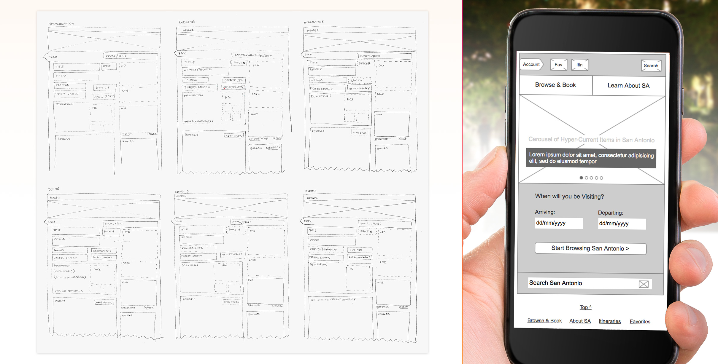
Architecture and Prototyping
I used both rapid forms of prototyping - sketching, shown here - and Axure to work through the architecture of this enourmous web platform.
You can view the Mobile Axure prototype here.
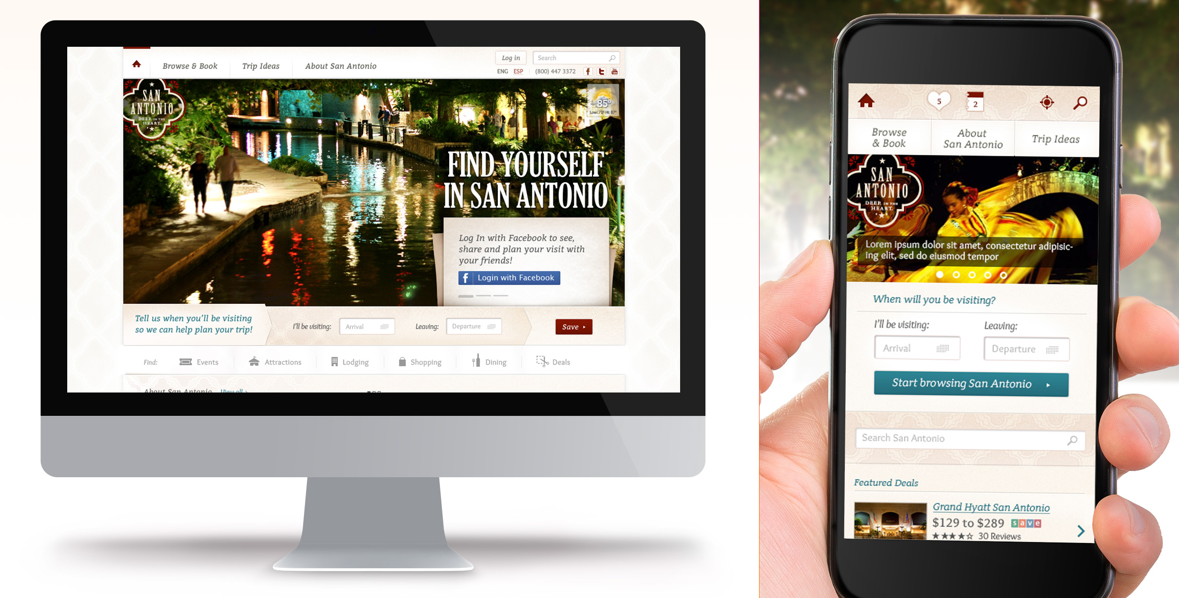
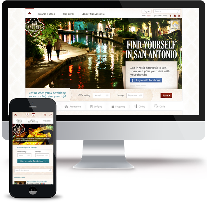
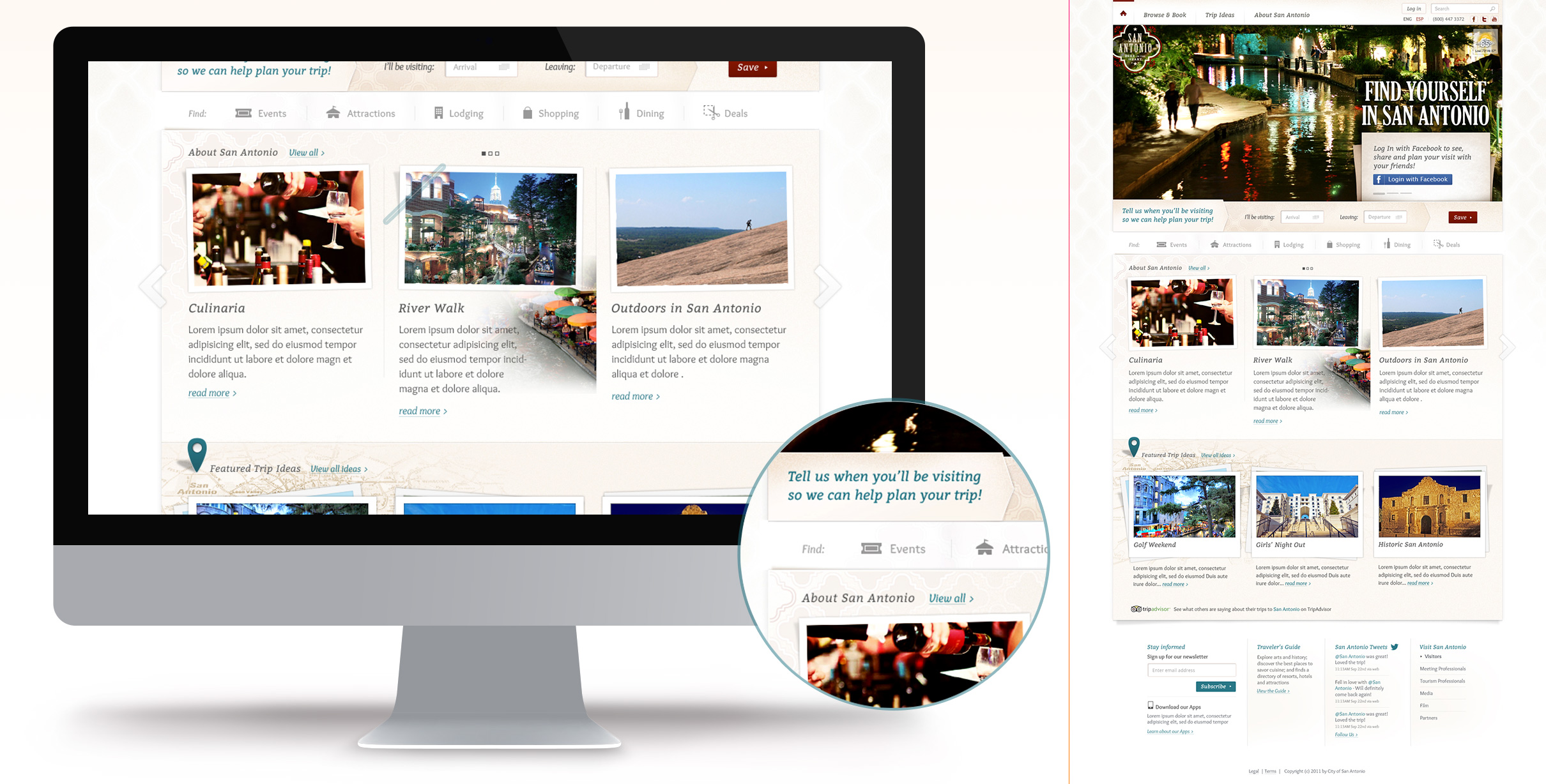
The Landing Page
As with any major website, competition for homepage realestate from various facets of the business entity was tough, but in the end we created an experience that met both the needs of San Antonio and more importantly visitors seeking to plan their trip to the city.
Right away, visuals from the City pull you in. First and foremost, our goal was to encourage Users to book experiences, and plan a trip to San Antonio. One of the first UI elements they encounter as they progress down the page is a Trip Planner. Setting the dates here would affect the rest of their experience, as the site could then cater options towards their actual travel window.
On top of that, the site was also built around thier social profile and preferences contained within the site - intelligently offering recommendations on where to go and what to see in San Antonio based the User themselves.
Design Detail
To truly represent San Antonio and what it has to offer, I came up with a design that incorporated various flourishes and elements reminiscent of Texas and its culture. The colors were limited but bright, and soft, and warm. Overall, the City Pictures were allowed to shine, while supported by an airy and welcoming User Interface.
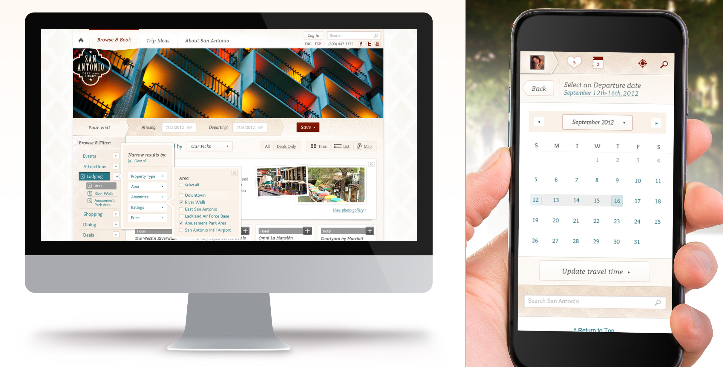
Browse and Book - Filtering
Browse and Book was perhaps the most important portion of the site. I took into account many facets of filtering and sorting to ensure the experience was easy and intuitive, on all devices.
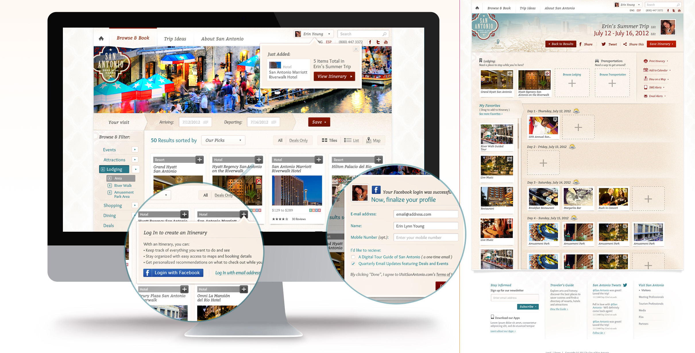
Browse and Book - Notifications and Education
Important to any interactive experience is the educational layer. I went through great lengths to supply the User with notifications that felt relative and timely, helping inform the User about things they could do and actions the had completed. As with any Usability approached project, Feedback is critical.
All of the Browse and Book system lead the User to the ability to build an itinerary. The itinerary was a critical piece as well, seen on the right, enabling the User to plan and manage a trip. Their trips could also be easily shared with other friends, encouraging more and more Users to hopefully travel to San Antonio.
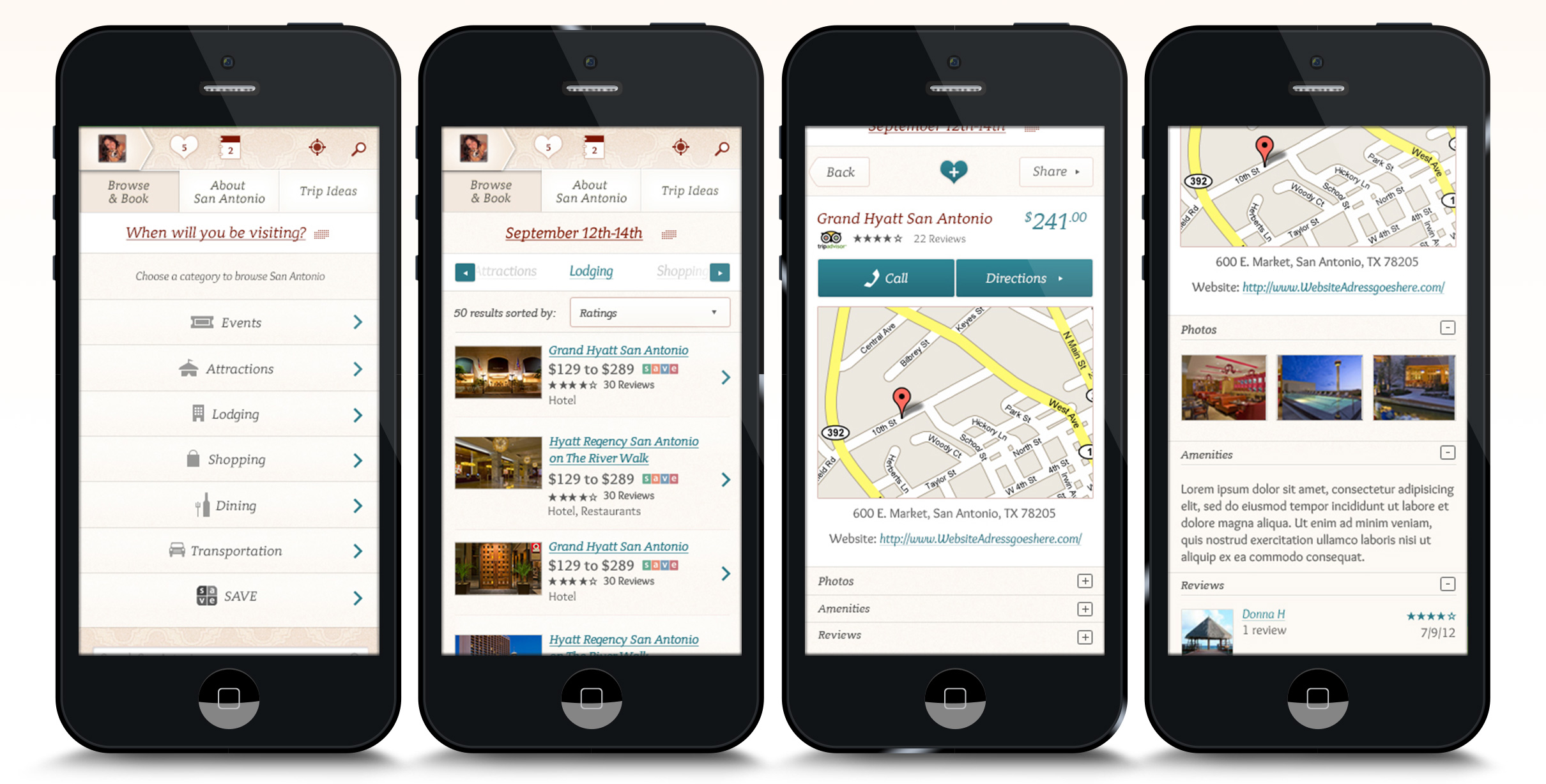
Mobile Booking Experience
The mobile experience across the site was obvisouly critical. Here, the Browse and Book flow can be seen. Using and utilizing best practices and current patterns, I created an experience that allowed the User the informtation they sought and the easy ability to drill down for more.
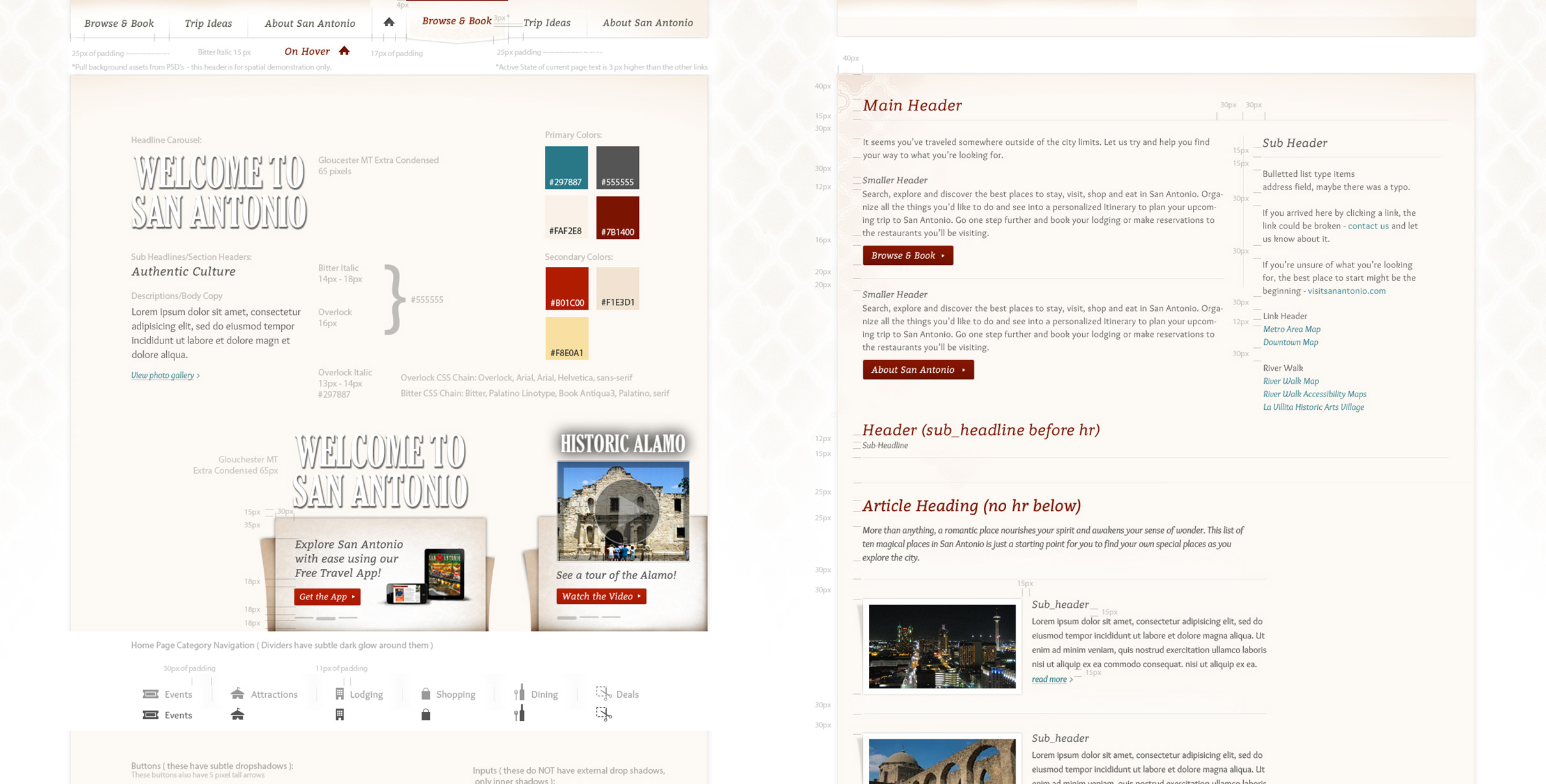
Style Guides
One of the later steps, I created a robust style guide to support the development team. Consistency, space and rhythm are all pillars of how I navigate through a design project such as this, ensuring these things are taken into account properly as development goes underway is paramount.

Selected work I've created
-
01 User Experience
- Gatorade - Sweat with the Best »
- Exadel - Responsive Redesign »
- Impact Journals - UX Redesign »
- Visit San Antonio - Tourism and Booking Web Platform »
-
02 Branding
- Exadel - Rebrand »
- Soapbox Marketing - Branding »
-
03 Product Design
- Voice - Blockchain Social Media »
- Verizon Wireless - Device Simulator »
- Undisclosed - Financial Enterprise App »
- FEMA - Community Rating System »
-
04 Usability
- Image Processing - Usability Study »
-
05 Visual / UI Design
- Mtn Dew - Gamer Hub »
- Vans Foods - Web Redesign »
- Mtn Dew - Assemble the Avengers »
-
06 Packaging Design
- Native Eyewear - Packaging Concepts »
- Mtn Dew - Spiked Lemonade »
-
07 Campaign Design
- 3M - Telecom Division »
- Mtn Dew - Black Label »

Some things I enjoy
Human Factors and Psychology, Ideation, Collaboration, UX Research, Strategy, User Personas, User Stories + Flows, Information Architecture, Wireframing / Prototyping, Art Direction, Mentoring / Teaching, Hierarchy, Visual Design, Leading Teams, Illustration, Conceptual Thinking, Live Music, Veggies, Beers, Hiking, And long walks on the beach.
You’ve reached the bottom, kudos. Jump to My Work, Learn About my Experience or Get in Touch. Perhaps, you'd like to return to the top?
© Tony Phillips